Sterling
brand identity | print | signage | tradeshow | logo
Overview
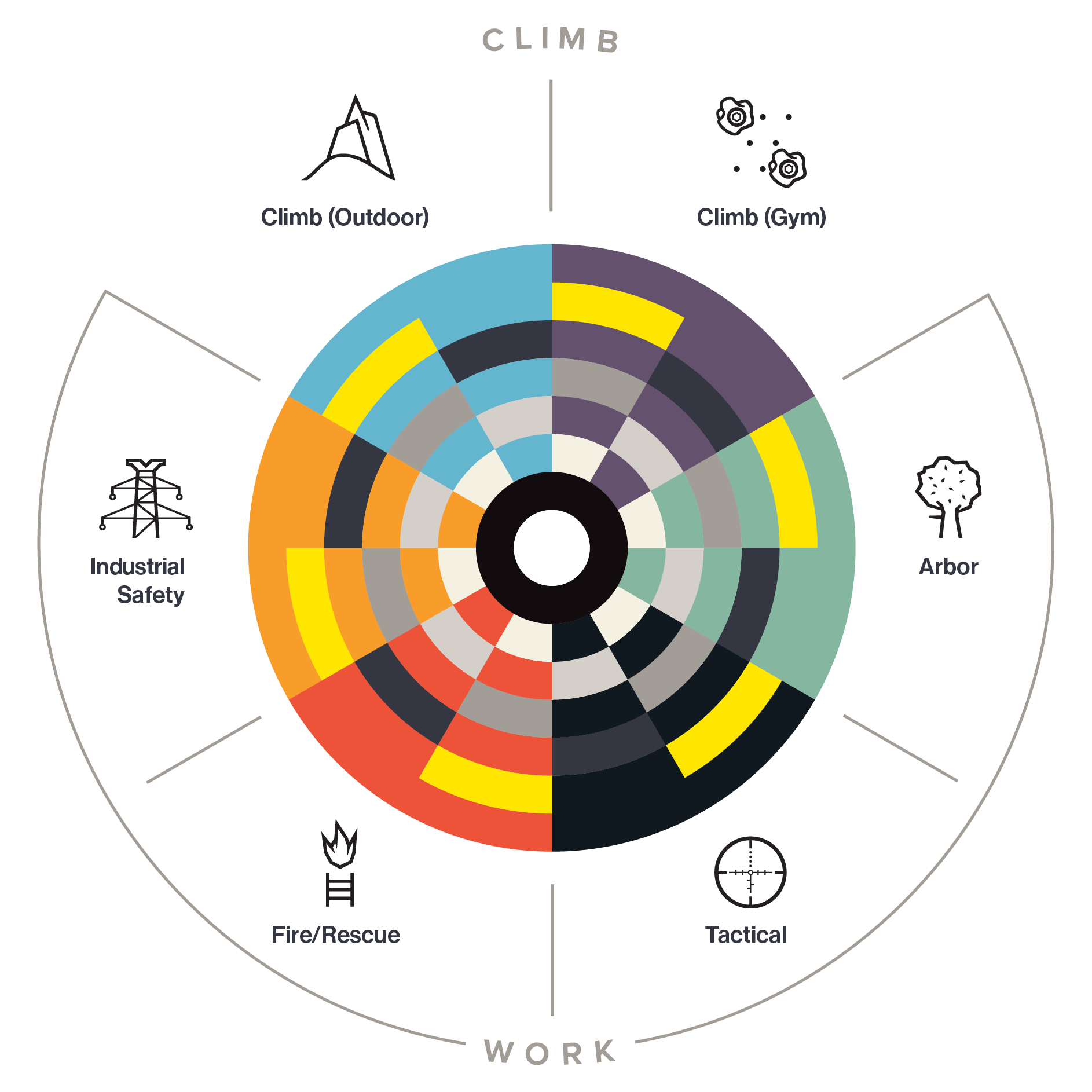
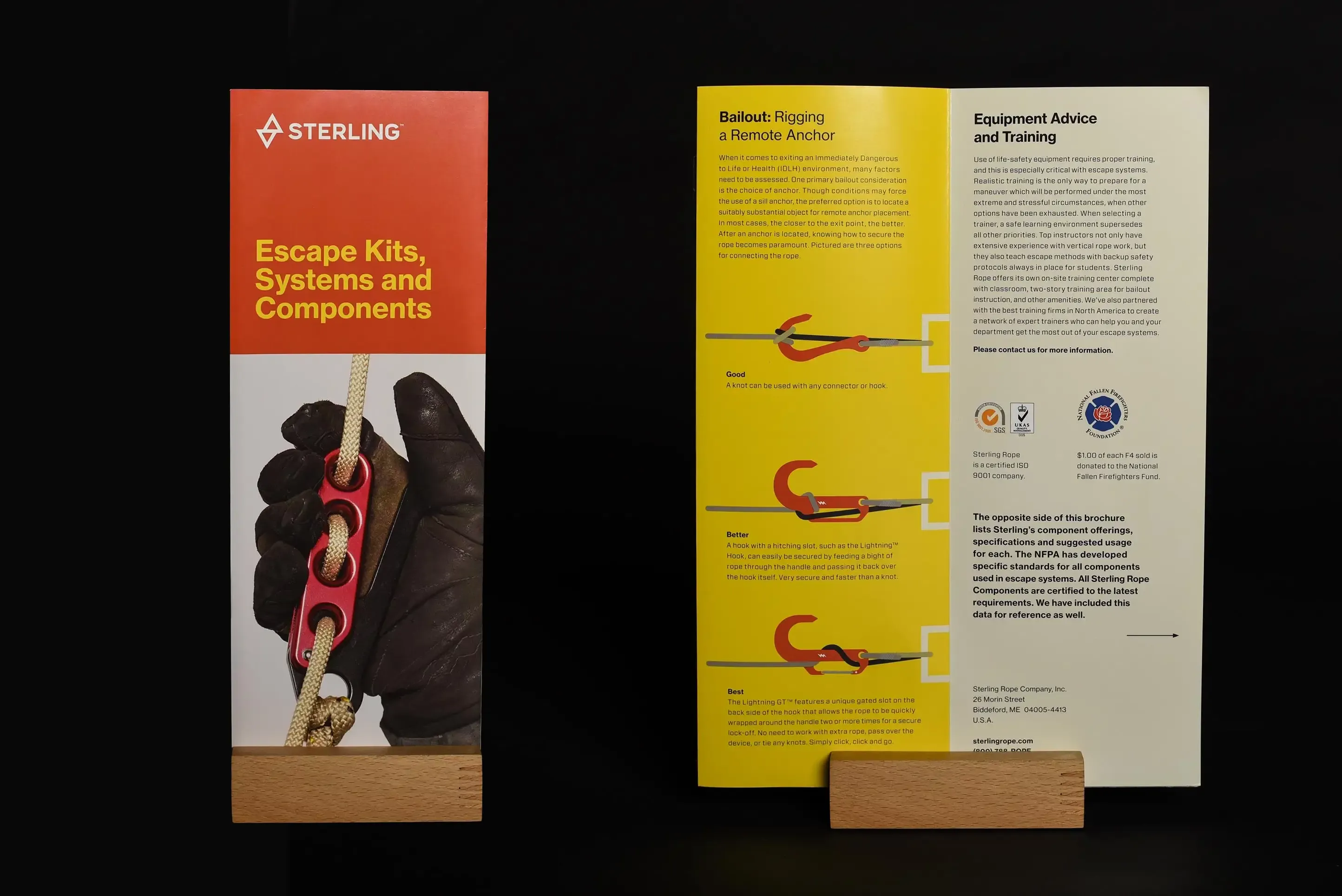
This extensive rebrand has thoughtful organization and clarity of purpose. The minimal yet highly conceptual logo unifies a wide range of products across two disciplines and many sub-industries. Color is the chief anchor and differentiator of this highly-respected rope and vertical safety company from Biddeford, Maine.
Brand Identity
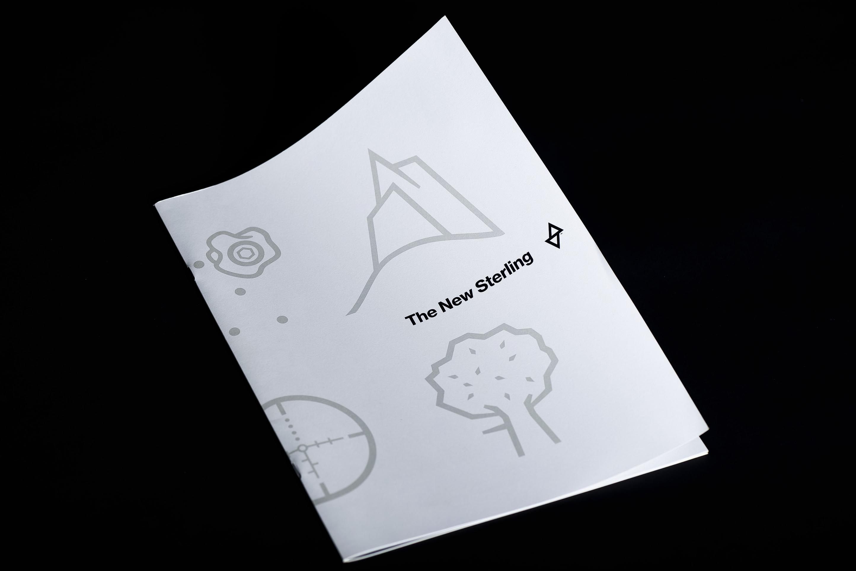
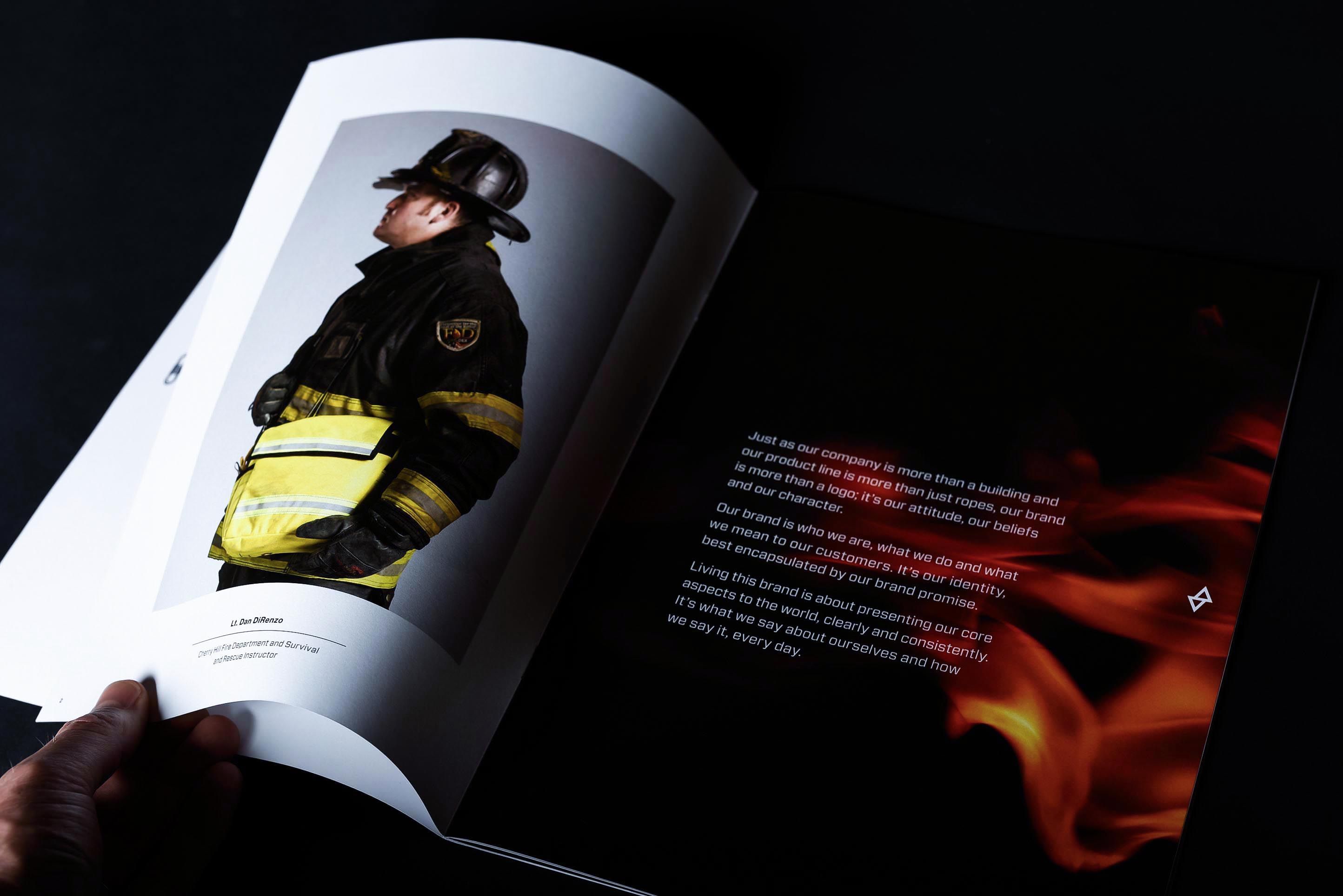
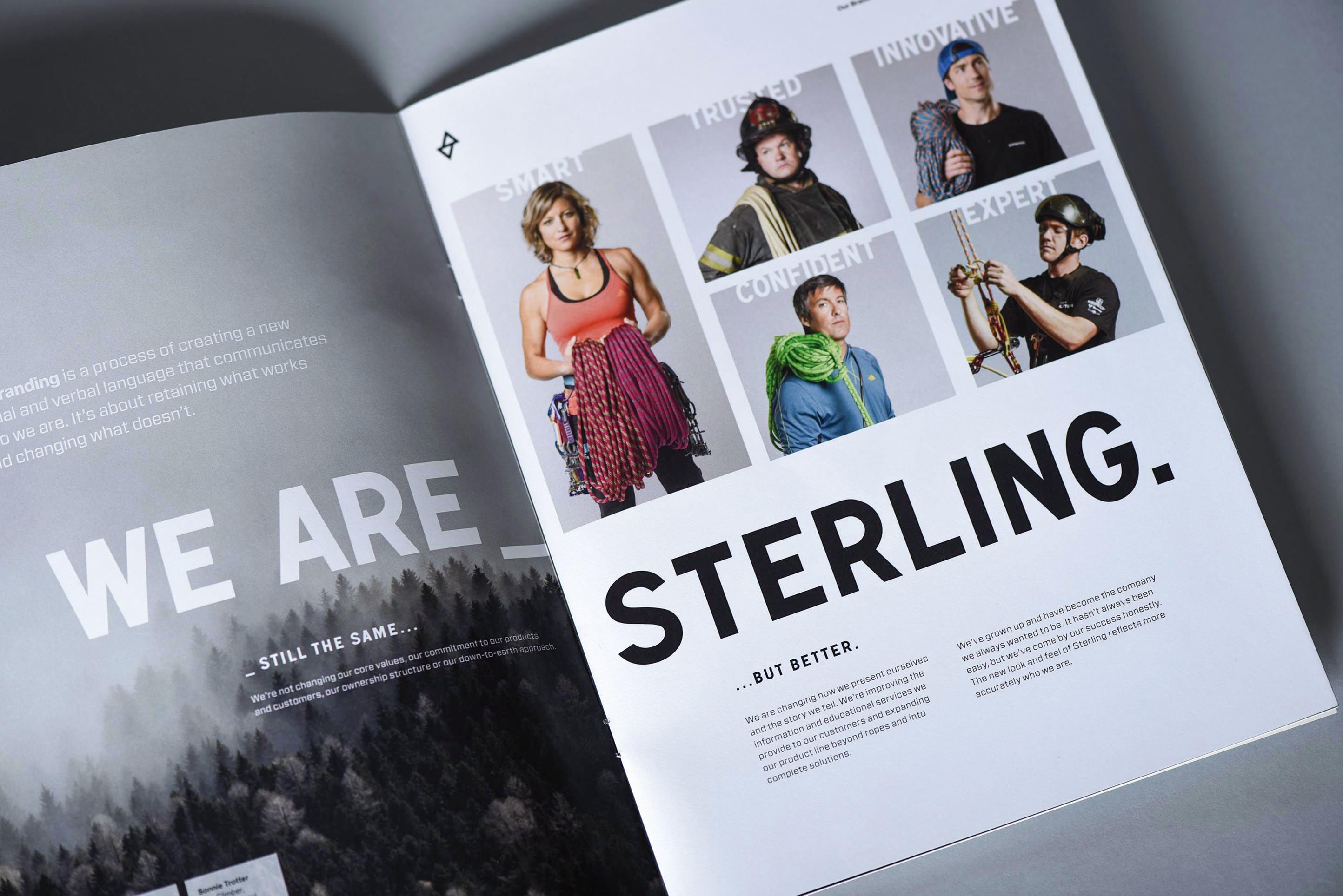
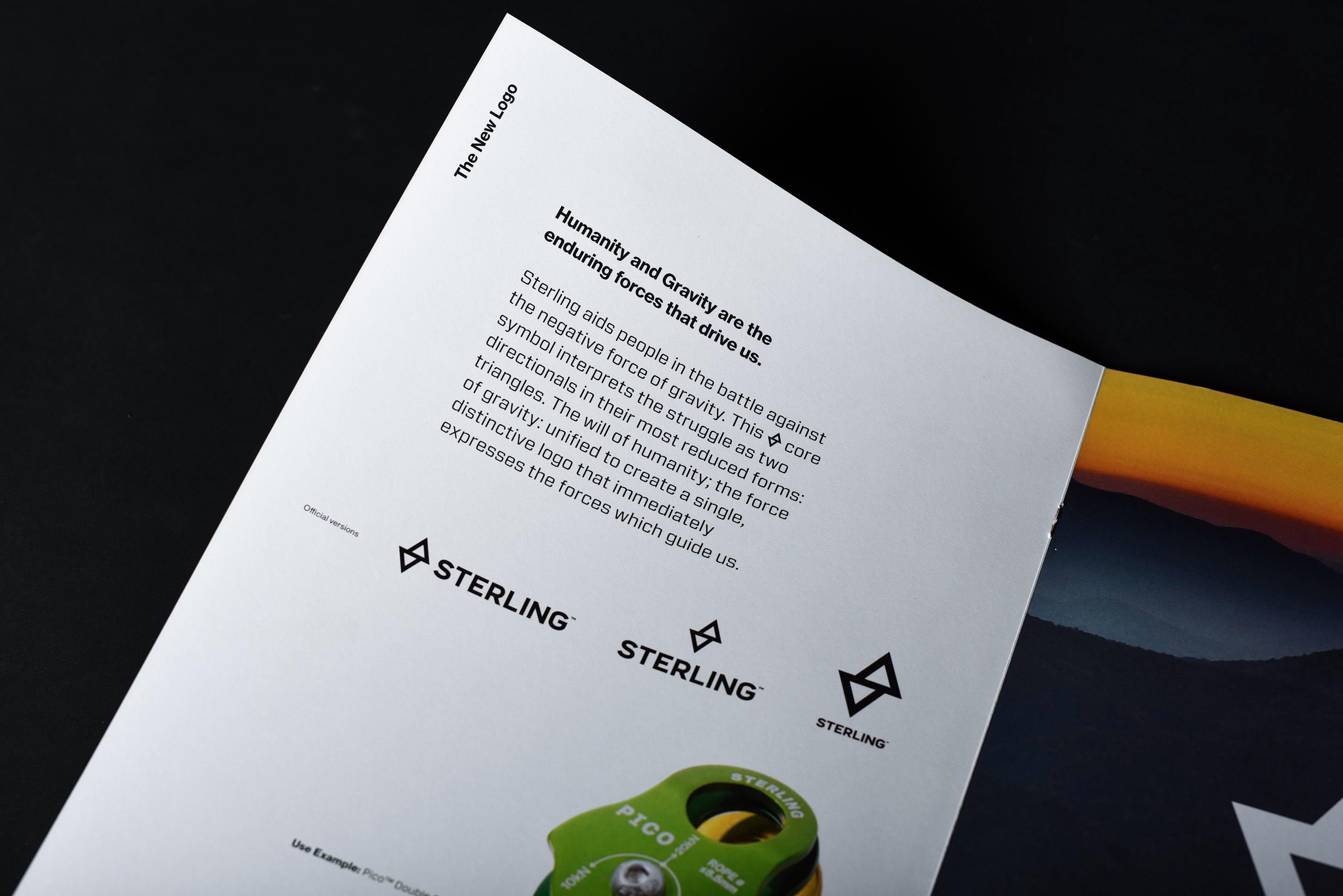
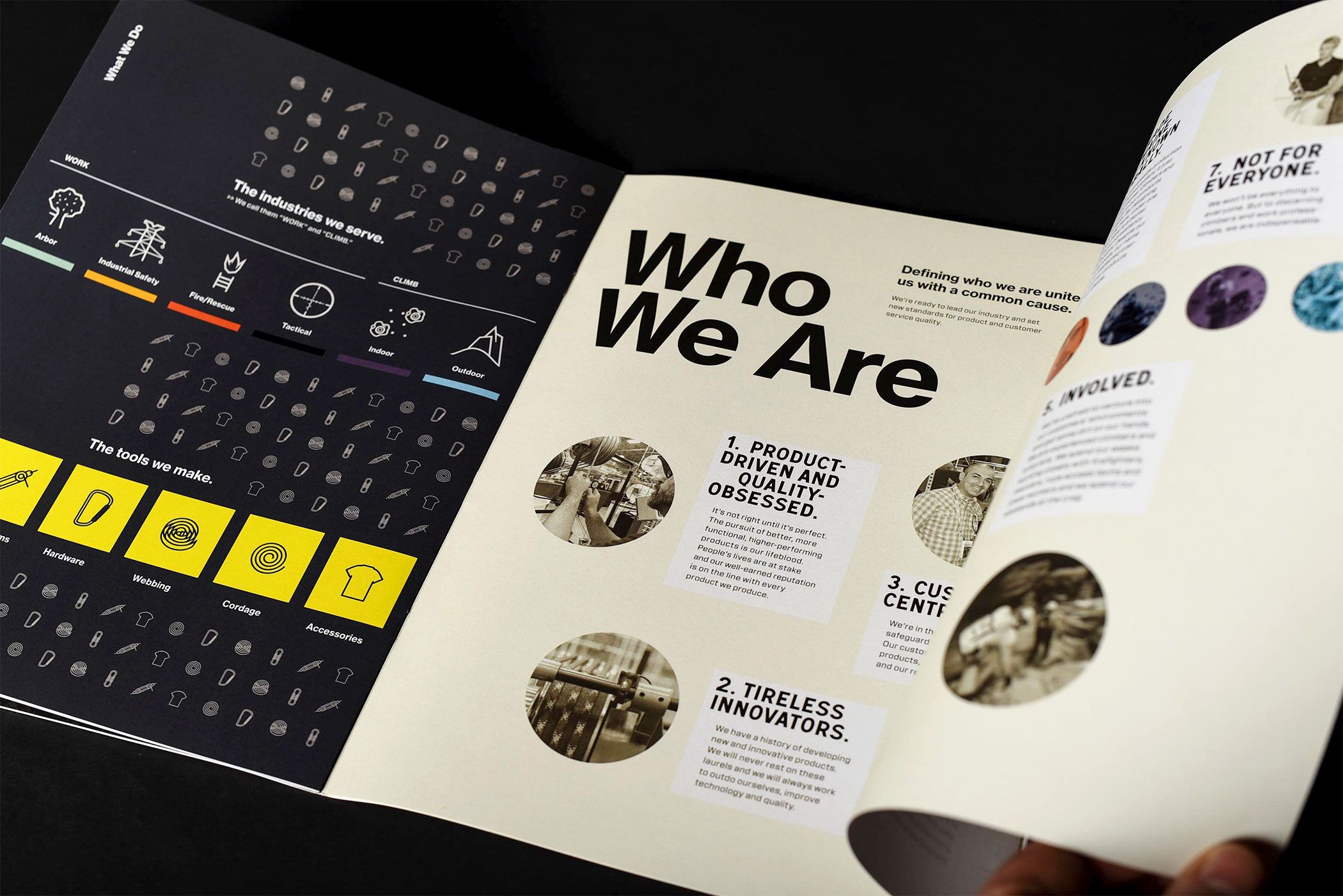
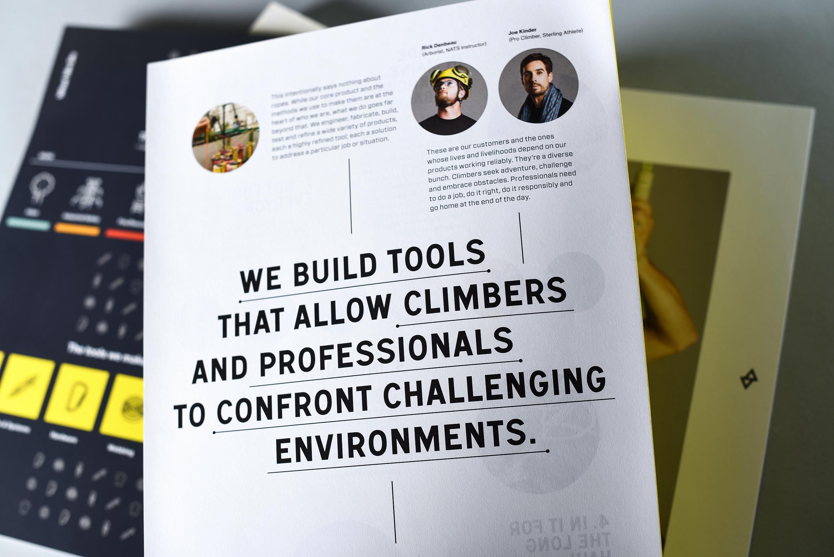
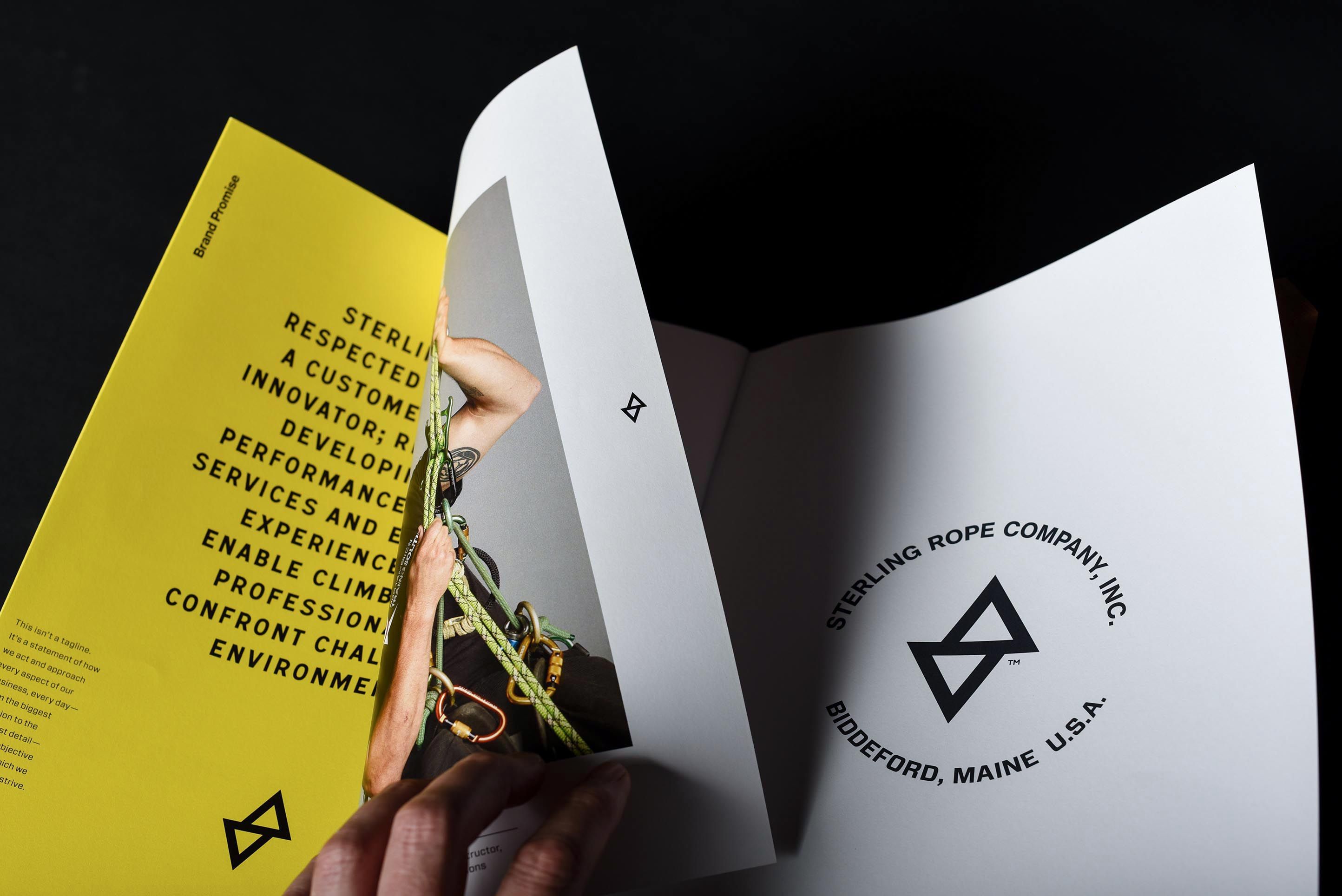
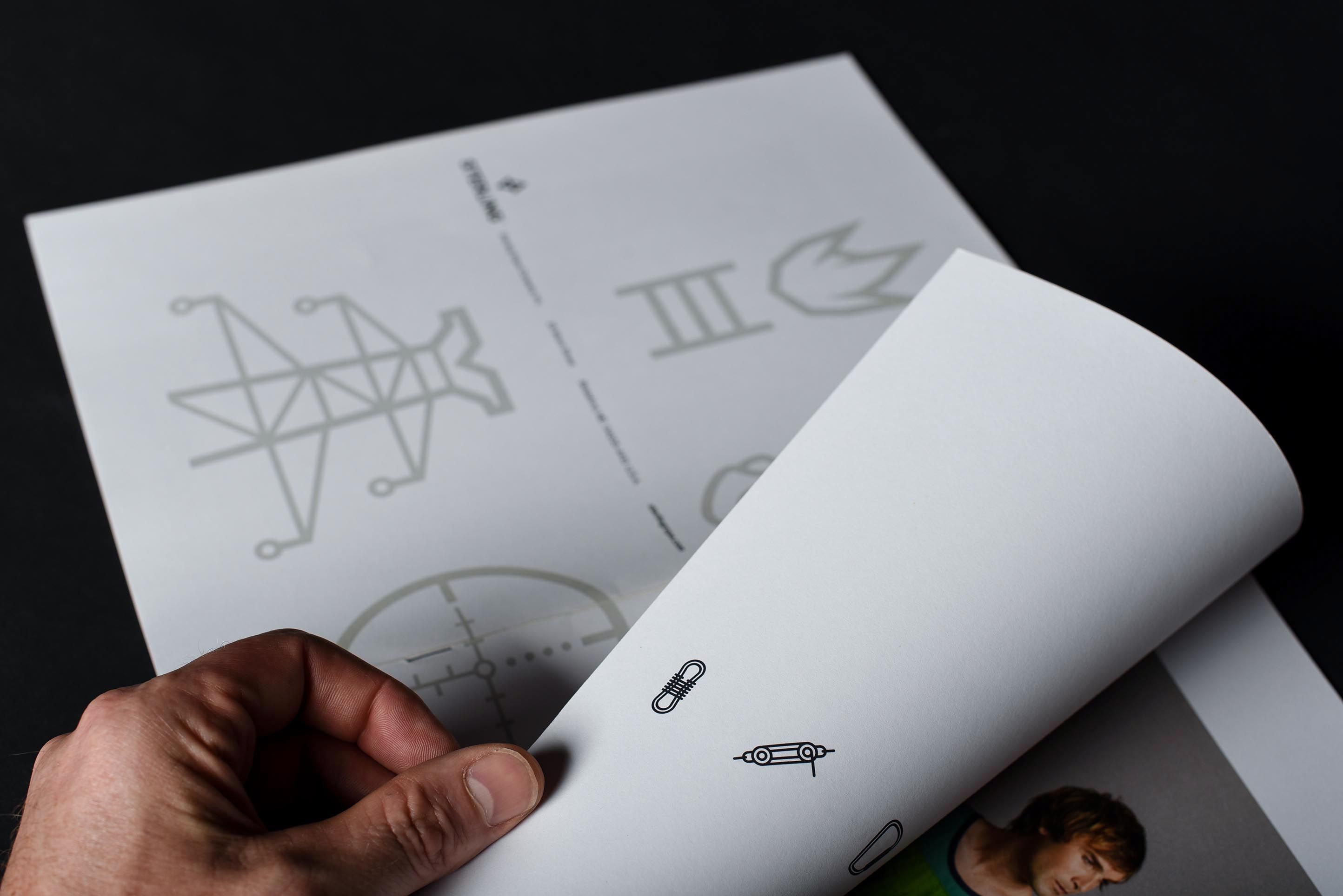
Brand Book
An employee-facing document setting the tone for the rebrand.
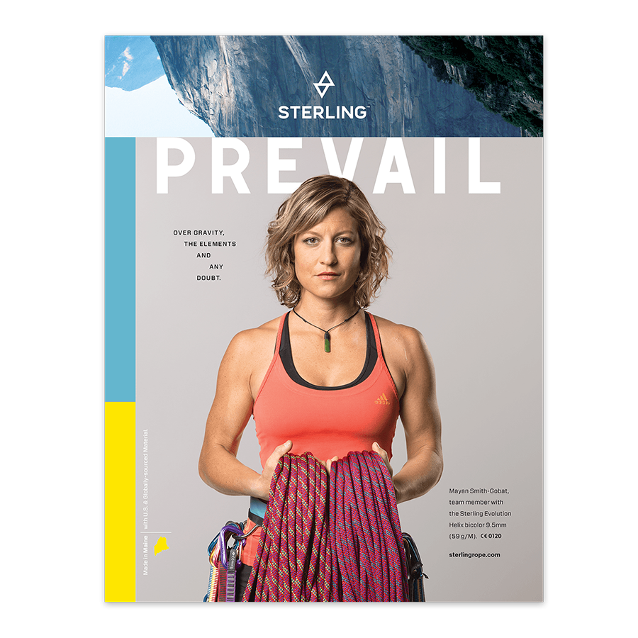
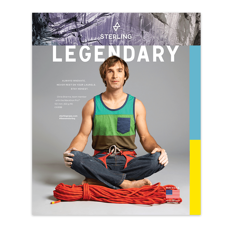
All portraits taken by Jeremy Harris with my art direction.
Tradeshow
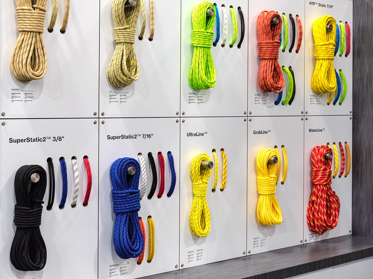
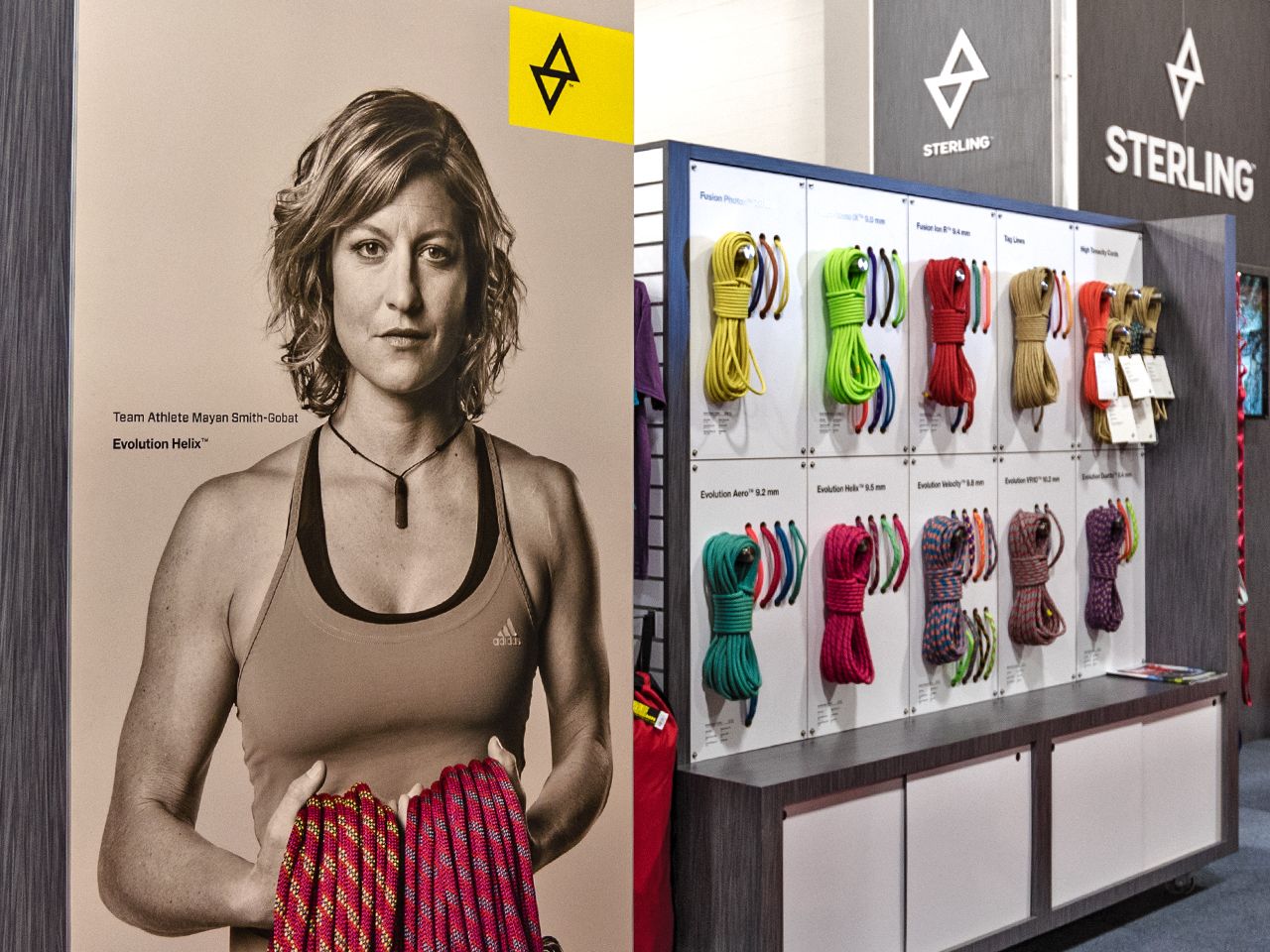
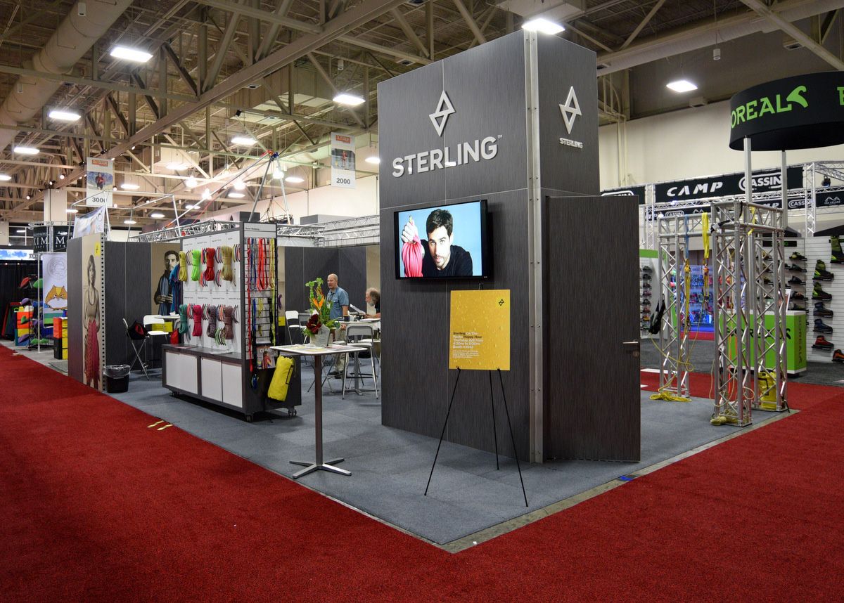
Modular panels display replaceable rope samples on custom-built rolling cabinets. Millwork by Creatacor.
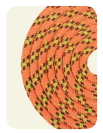
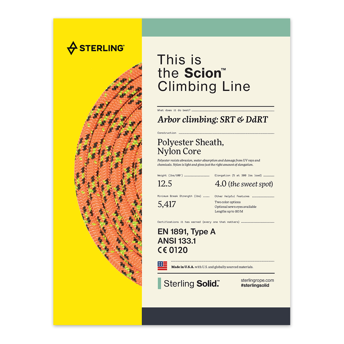
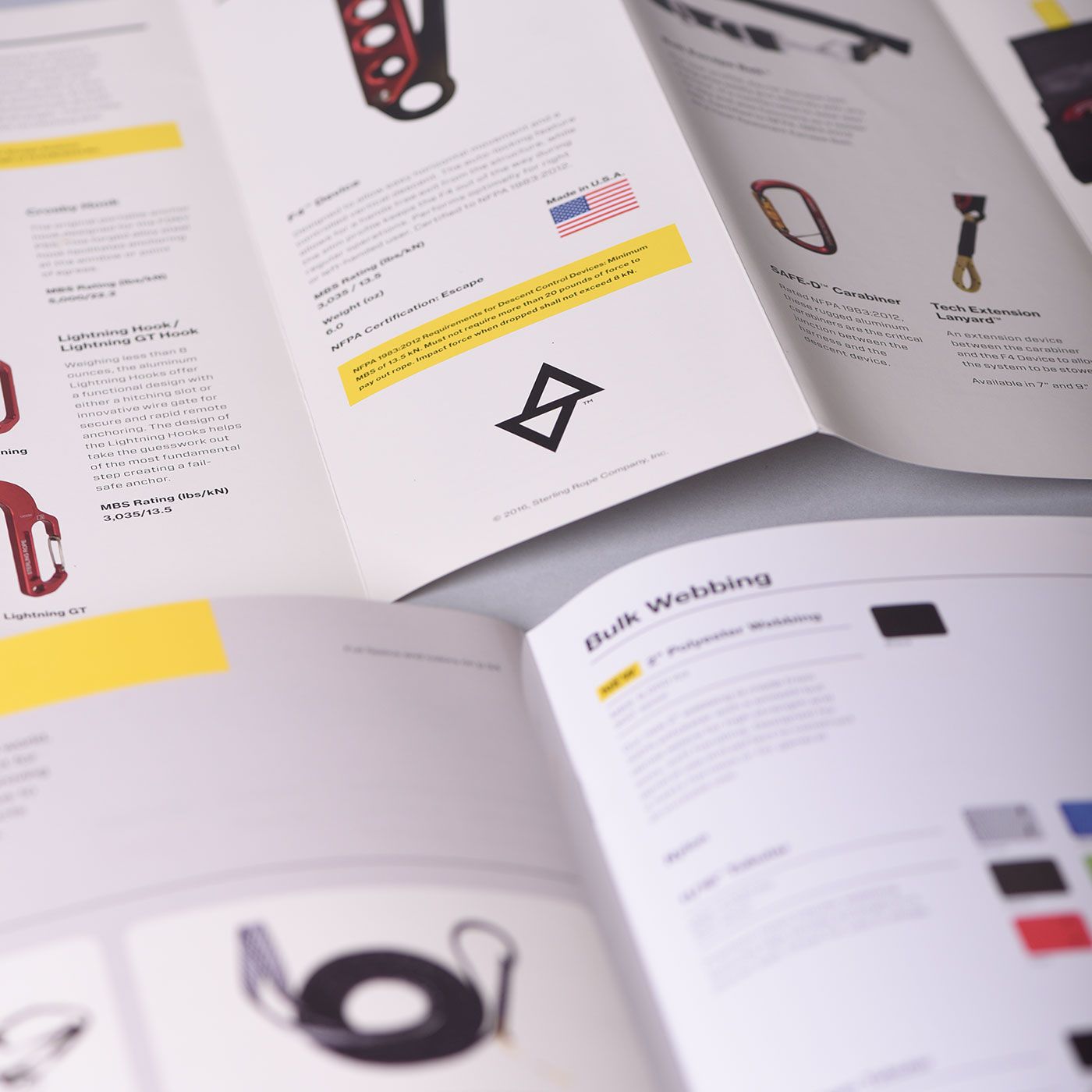
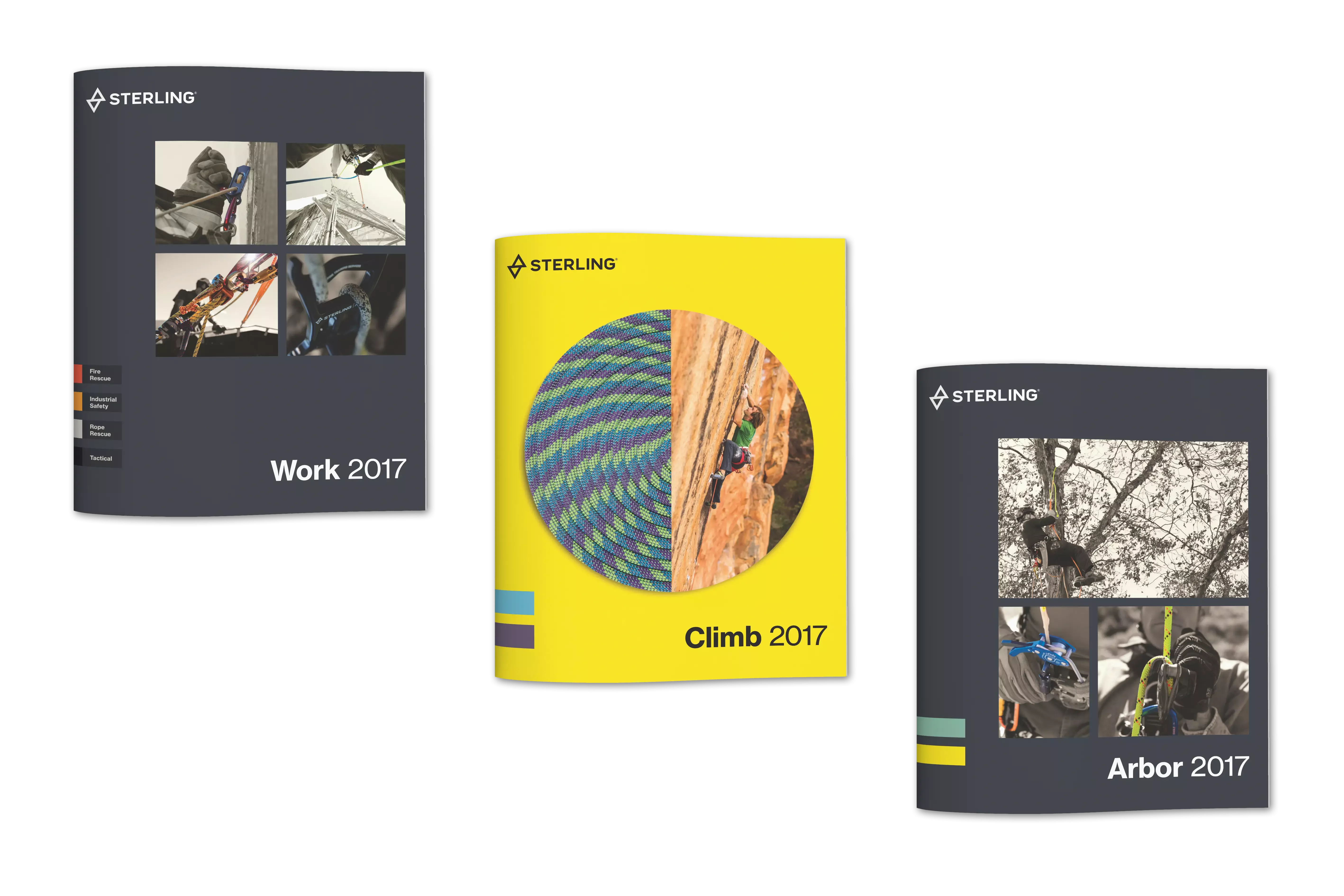
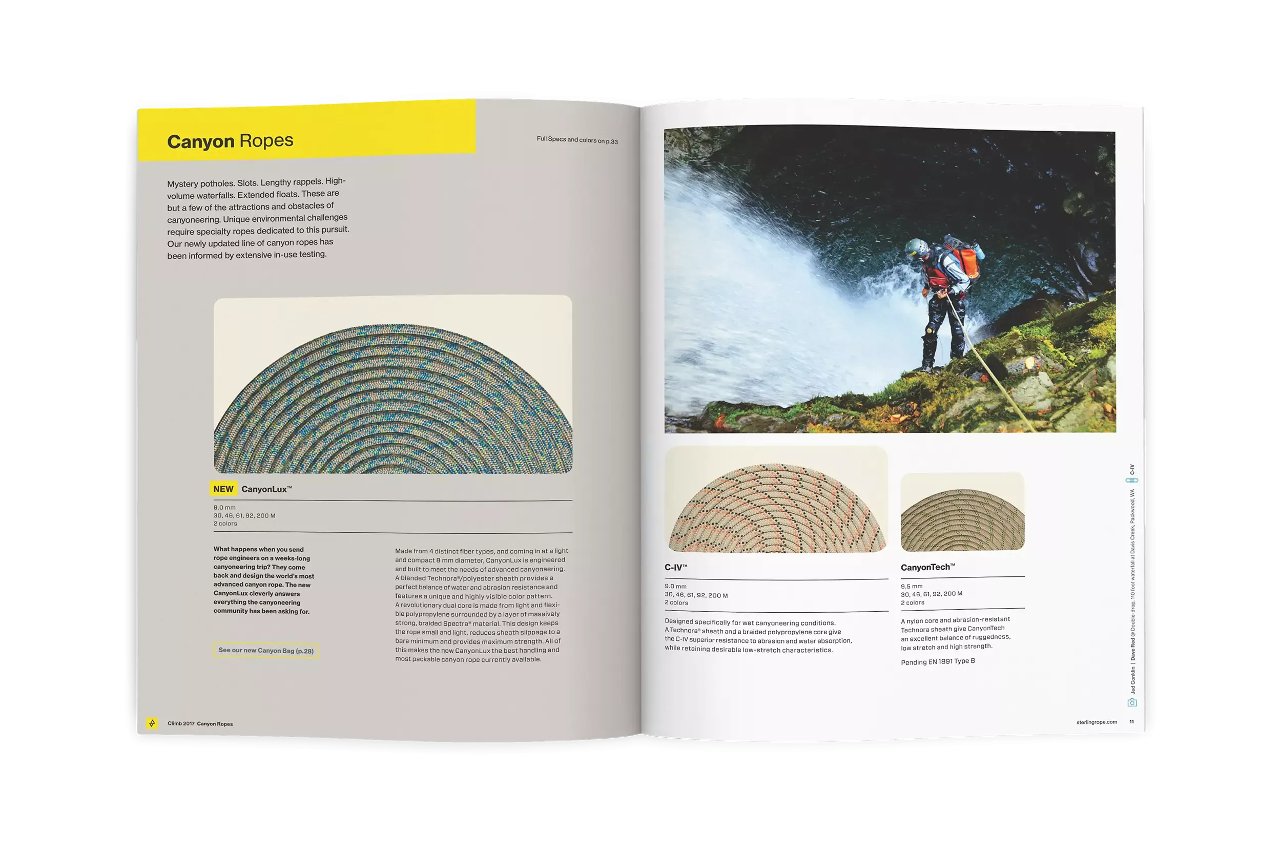
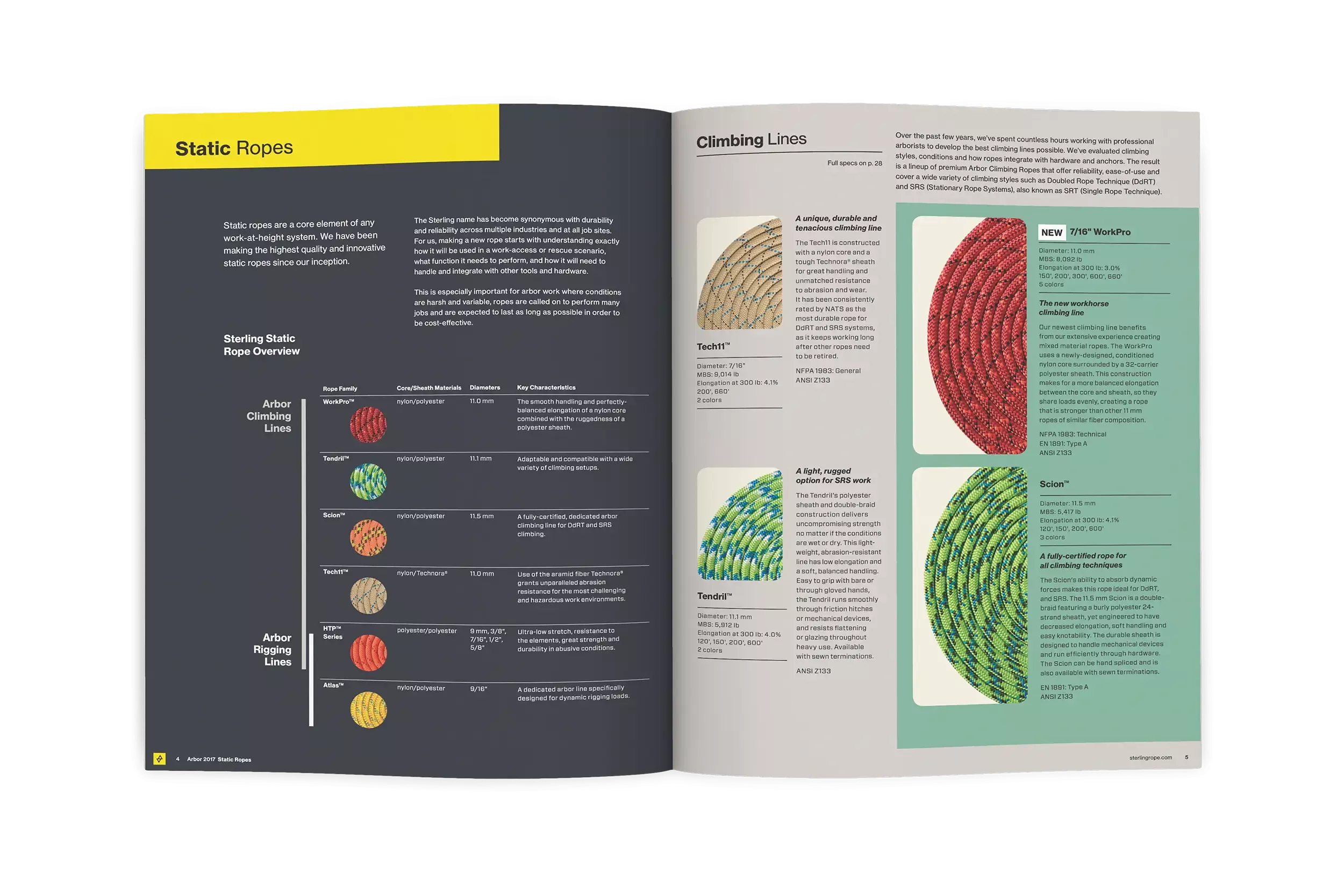
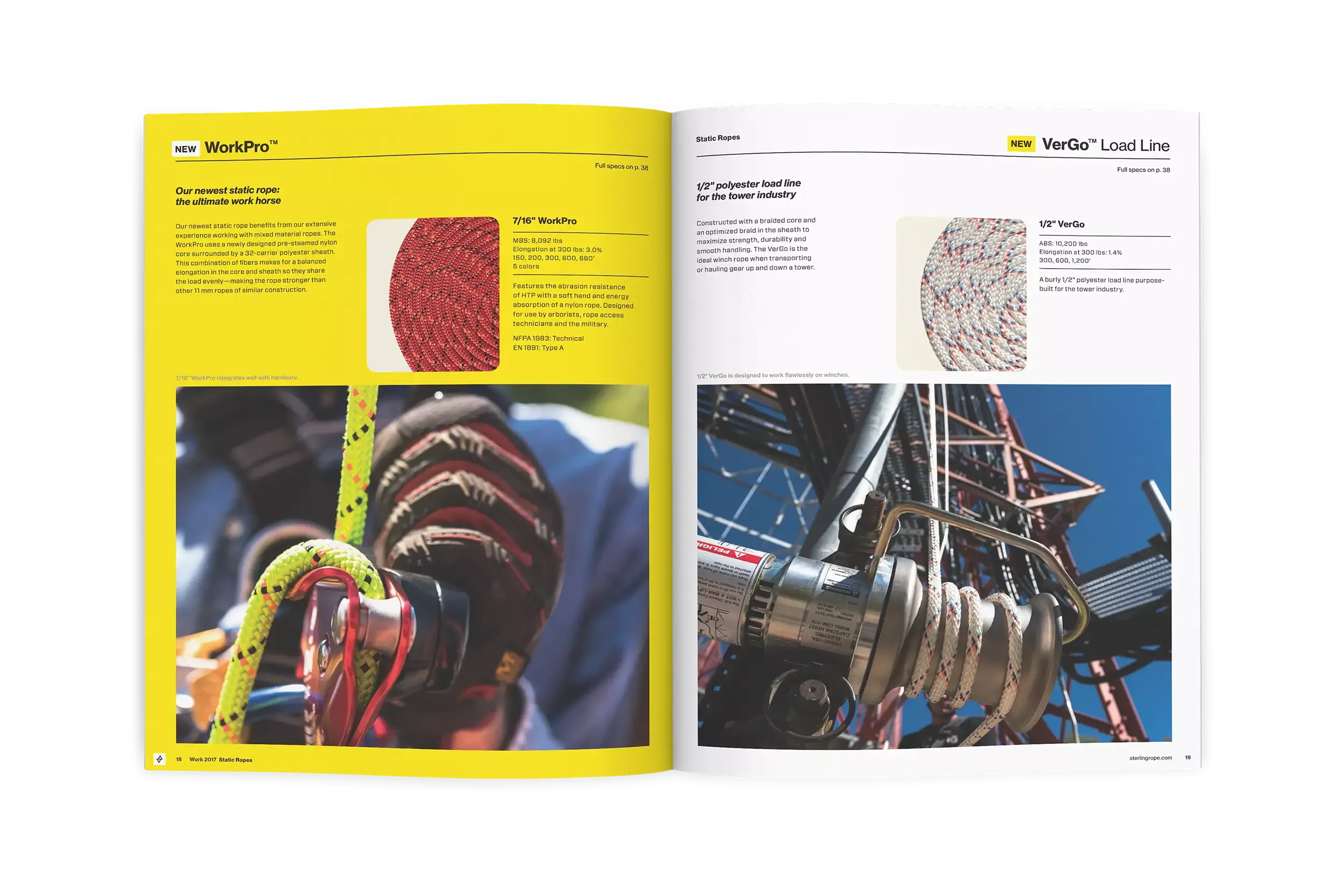
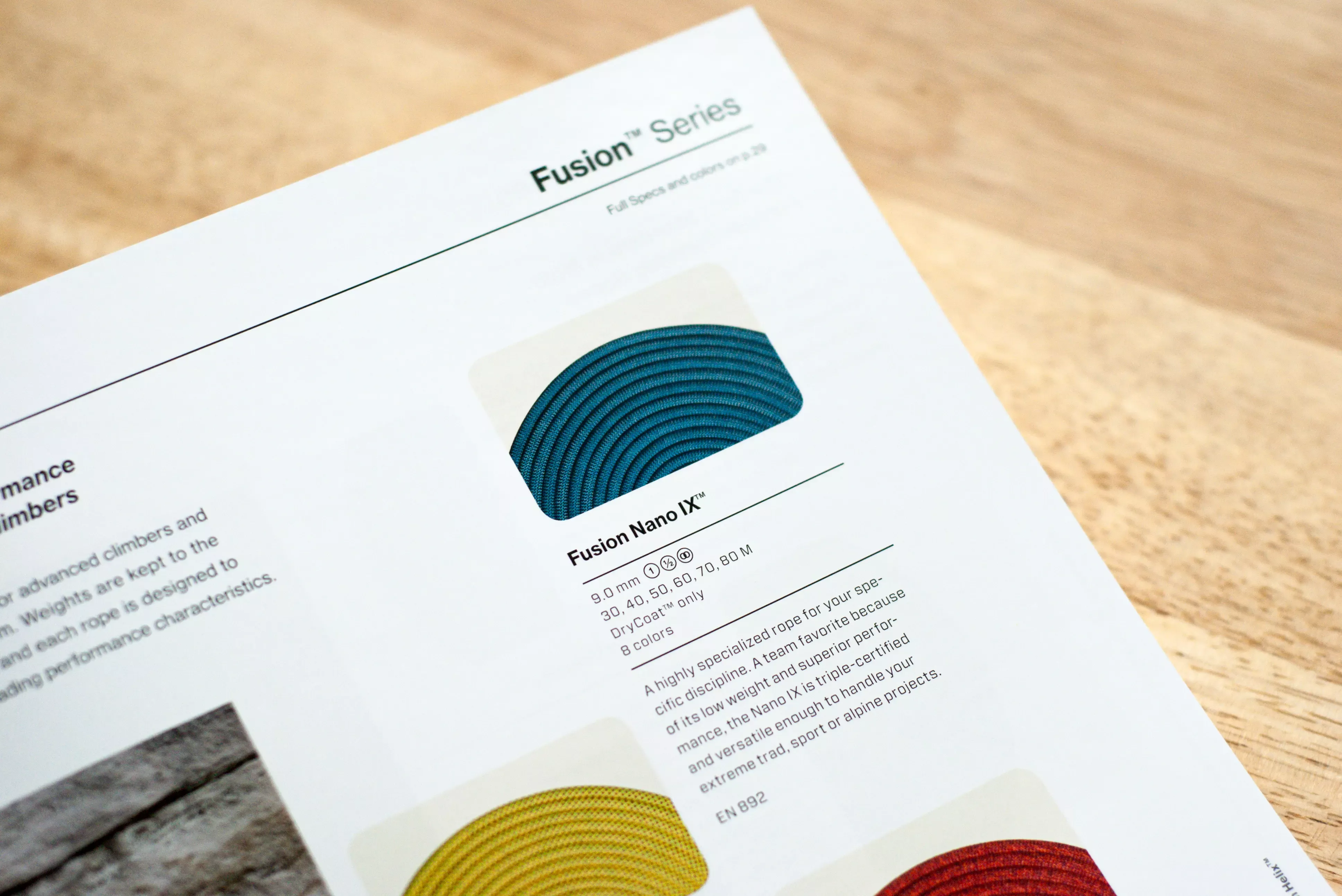
Note: The prevailing industry convention for rope photography is a figure-8 "hank". Awkward in form, the hank undersold the rich patterns and colorways which Sterling ropes possess. I devised a simple coiling standardization, shot over backlit glass, for product photography (seen in the above catalogs) that solved that problem. It is engaging and dynamic, shows greater product detail and can be easily repeatable for a variety of rope sizes and applications.
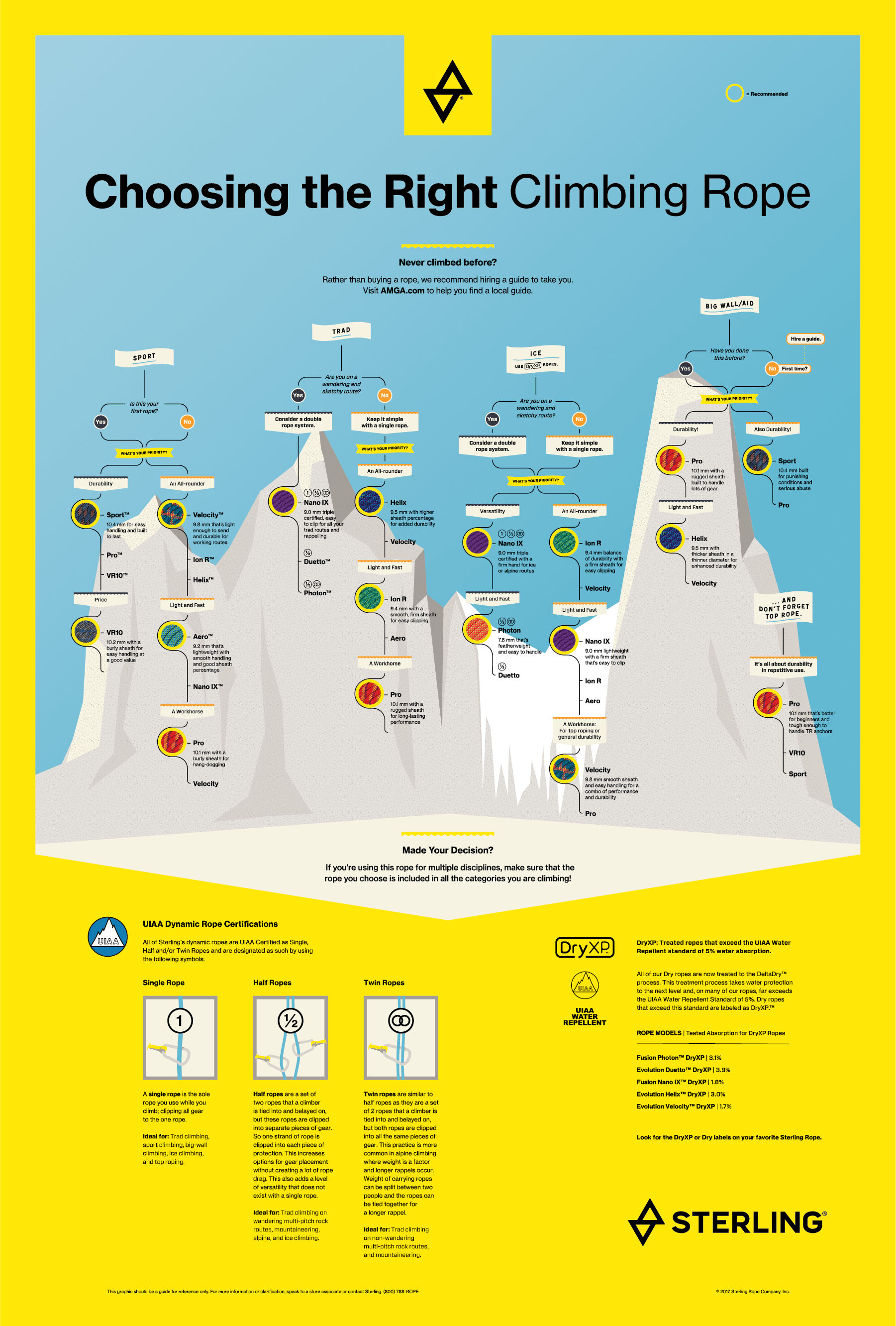
Poster
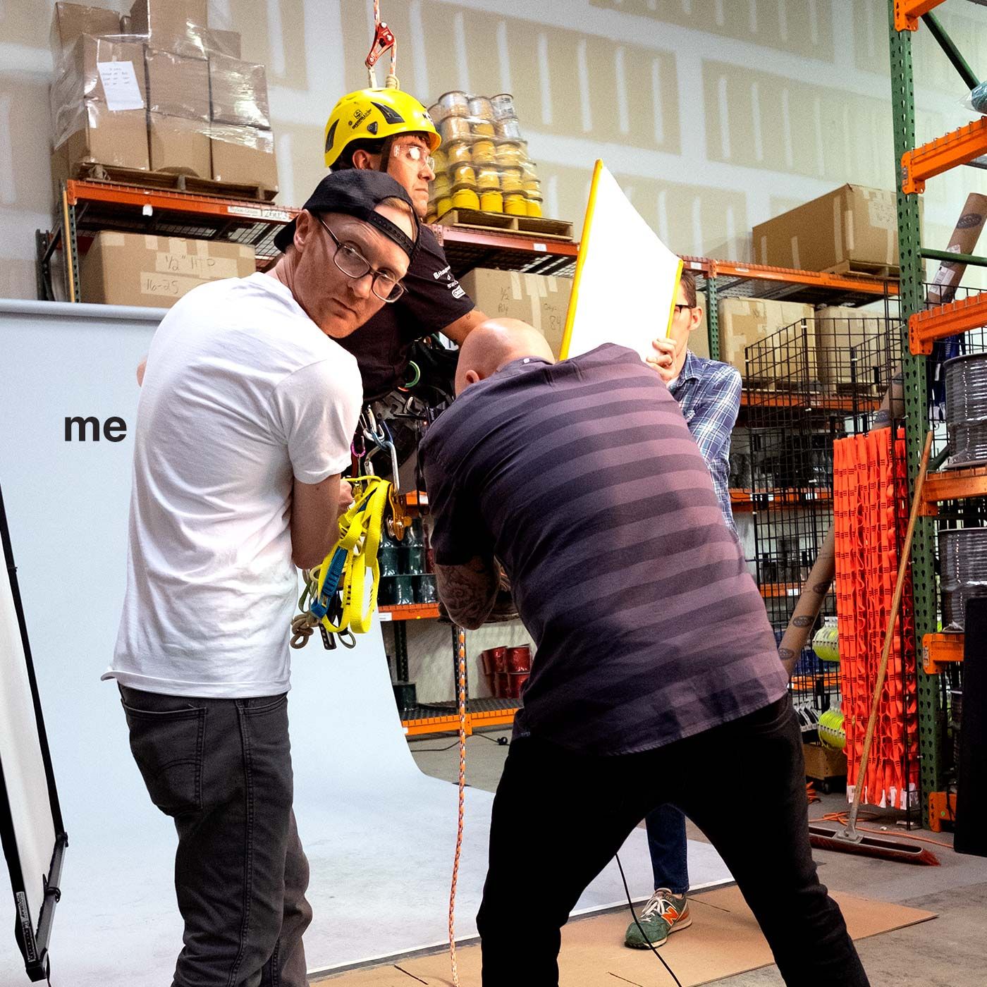
On-location art direction
Brand photo shoot
Brand photo shoot
