GPES
Overview
A distinct logotype and branded house strategy frame the offerings of this fund management software company with familial origins.
Backing up a Bit
Prior to GPES, I updated the visual branding of its sister company—GP Fund Solutions (GPFS)—a fund administrator based in New York with offices abroad. Ambitious, highly-skilled and devoutly employee-focused, GPFS had out-grown the wardrobe of its initial branding and sought an aesthetic refinement to better reflect the values and position it occupies within the accounting industry. To that, I created several brand refinements starting with a logo rework, color and typography selection, compositional arrangements and original photography, all culminating in the design and buildout of a new website. A sacred cow, the company's original symbol found a harmonious pairing beside thoughtfully-selected type in several new, handsome arrangements.


GPES is a fund management software company and the discrete but genetically-related sibling to GPFS. Led by industry insiders, GPES creates intelligent and elemental life cycle products to ease pressures shared by fund managers and investors, alike. Its overarching logo system, therefore, qualified as a branded house; the design of which expresses those truths with a nod to the greater GP family.
Core Logotype

original lettering
Designed to imbue the feeling of technical proficiency: sturdy yet surprising, hardworking, regimented tonality in an ownable typographic structure. The attitude is commensurate with a confident, worldly endeavor.
Logotype Origins
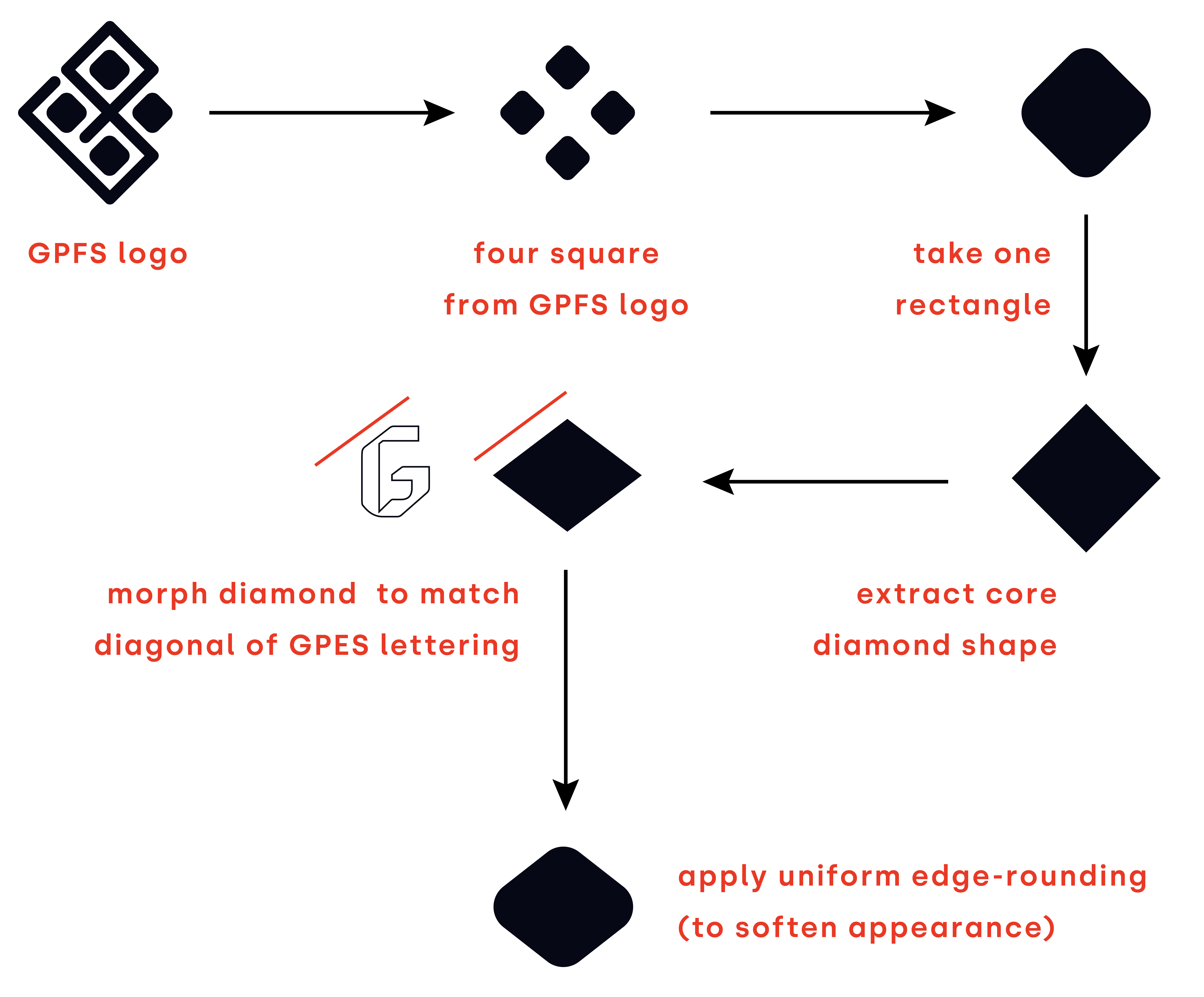
Seeking to maintain a familial connection to GPFS as well as to devise a badge container (per the client), I used the following logic:
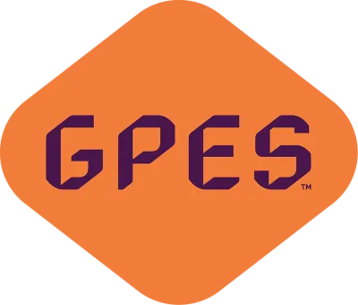
Full Logo Badge

badge with full clarifier
(set in URW DIN)


full clarifier logo
GPES Product Logos
Branded house strategy: “GP” references the parent, while standardized color and type express individual products.


"Powered by" logos
Clarifiers for downstream partnerships.
