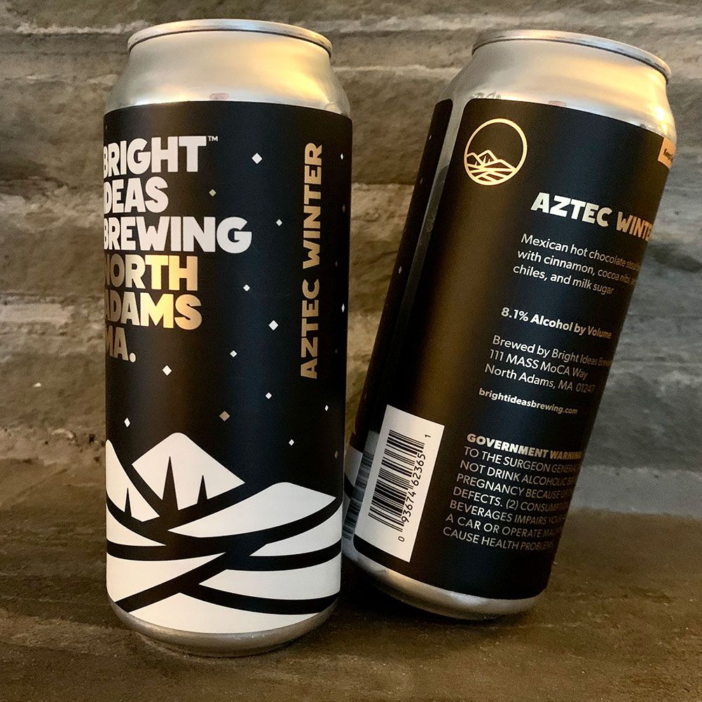
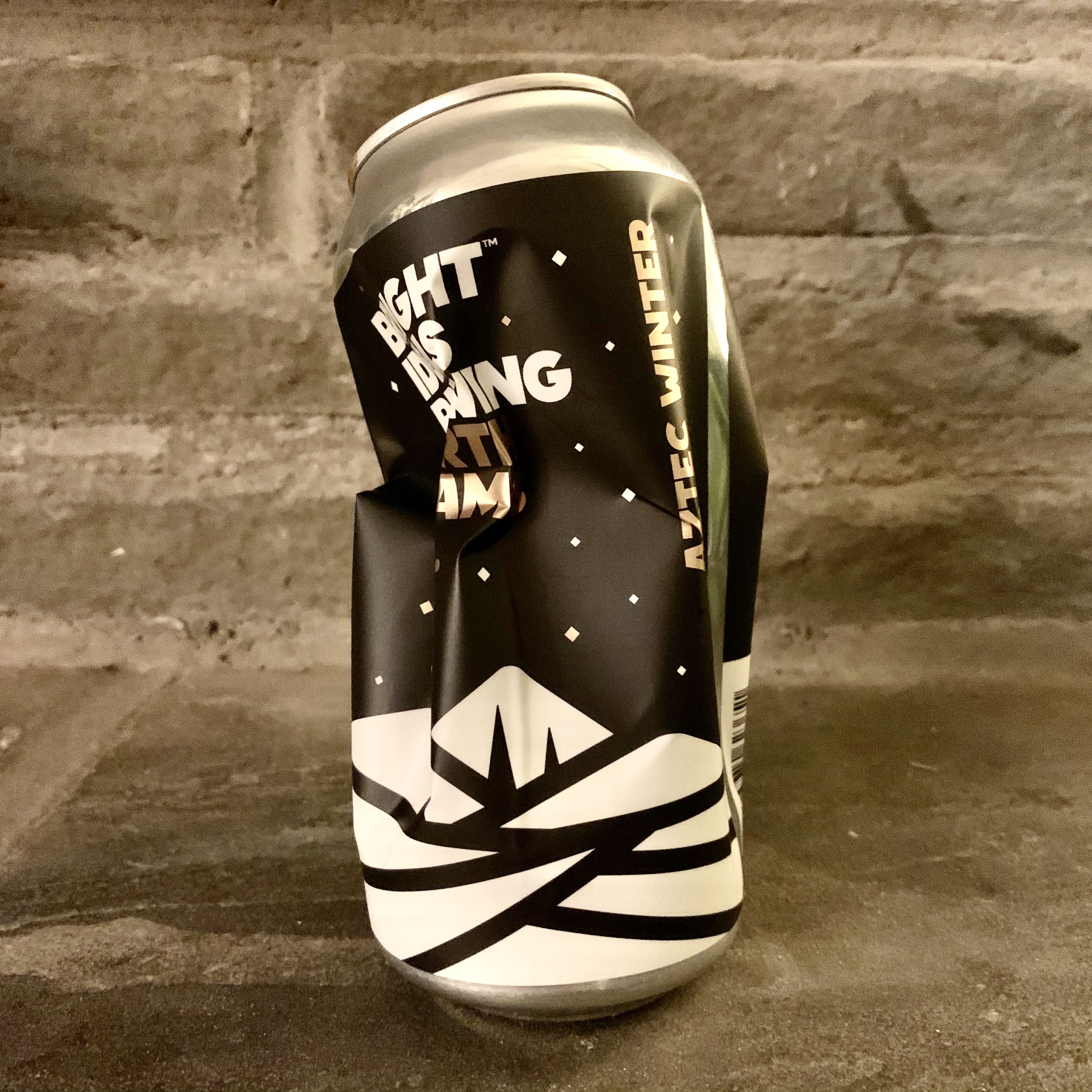
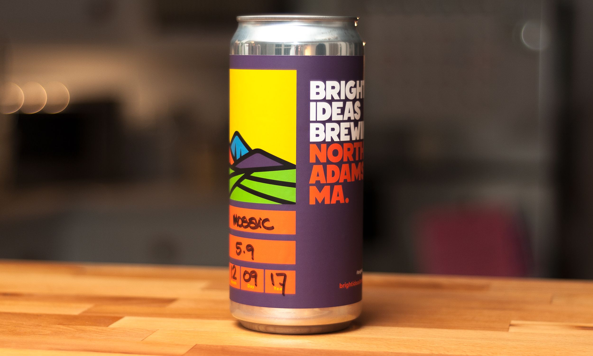
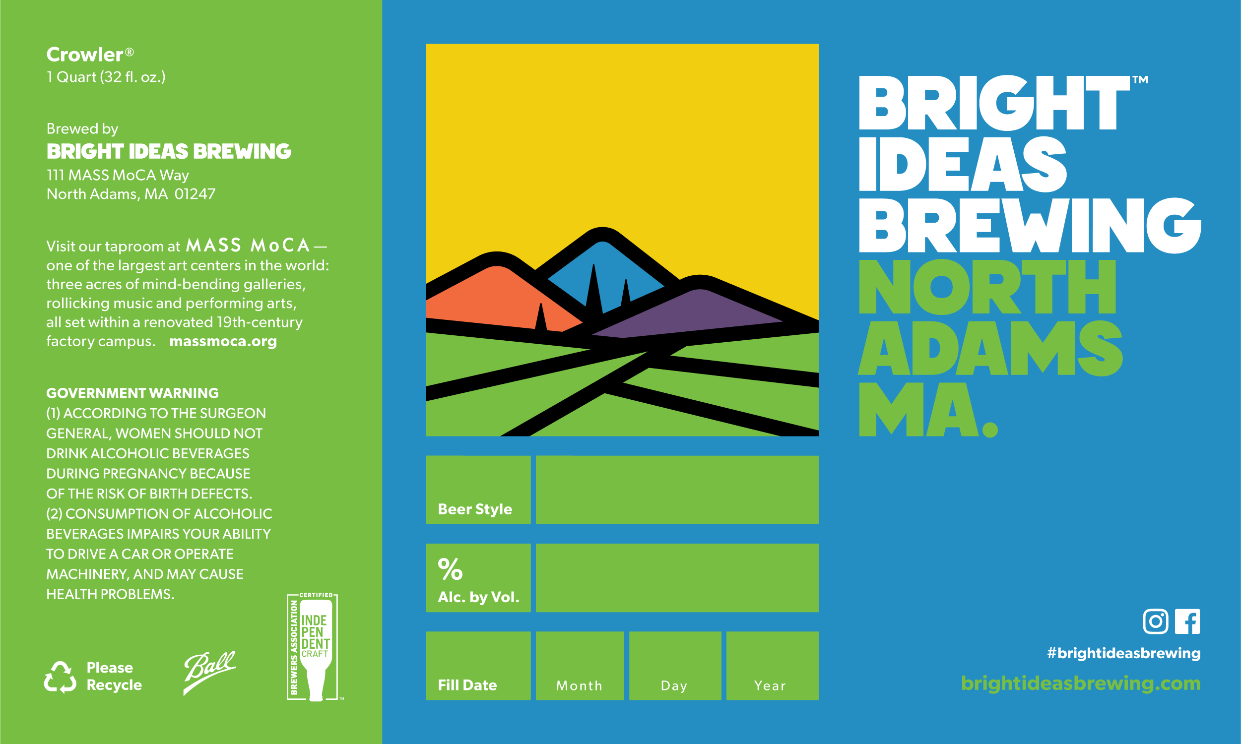
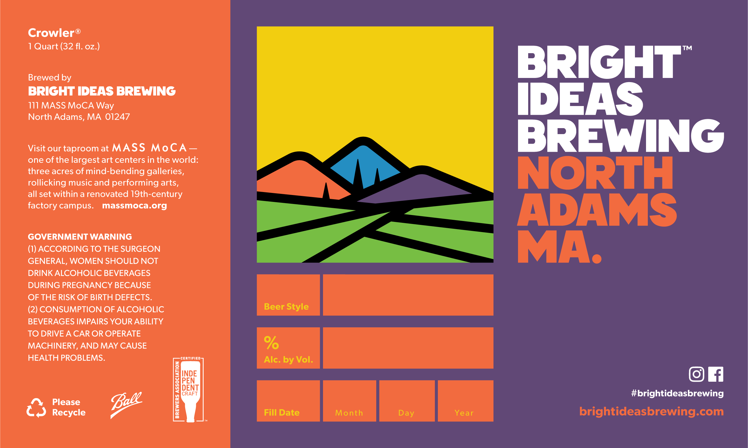
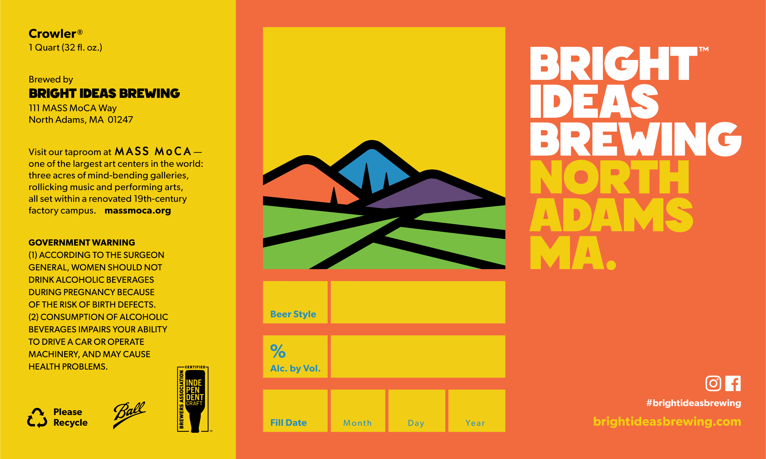
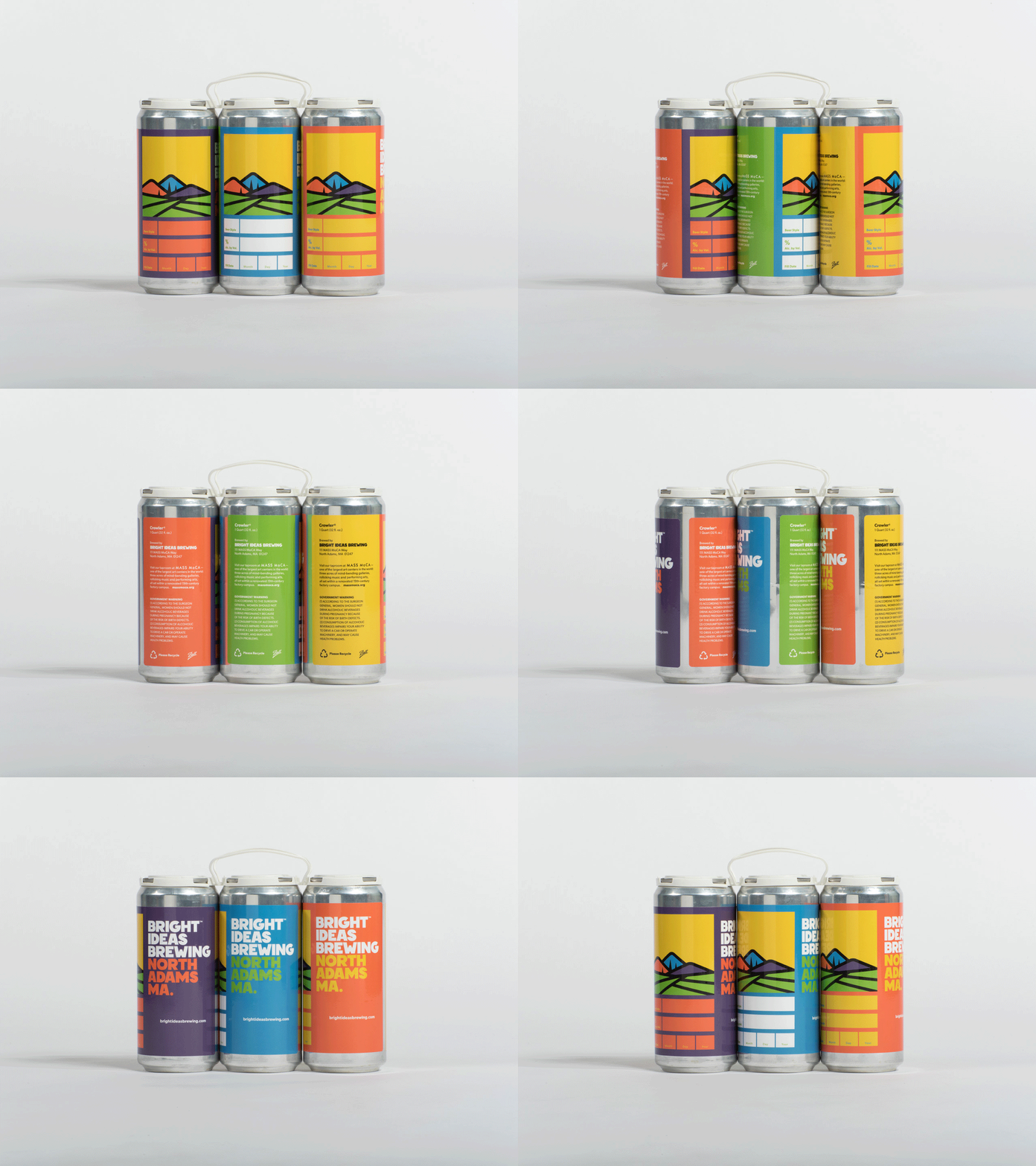
A ground-up brand identity for this nanobrewery in North Adams, MA.
The term “creative economy” may induce a prolonged eye-roll, but in the former factory hill town of North Adams, Ma, it’s a viable force for positive change. ...read more High on the list of values spurring citizen-based economic revitalization is, you guessed it, beer. And Bright Ideas Brewing is the place to find it fresh.
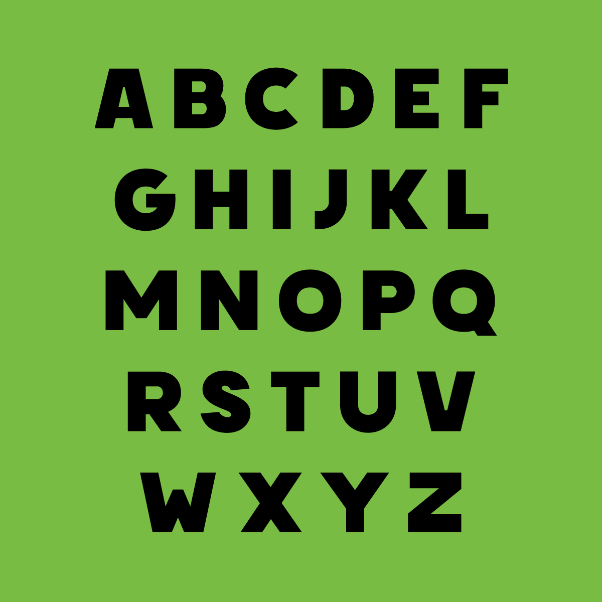
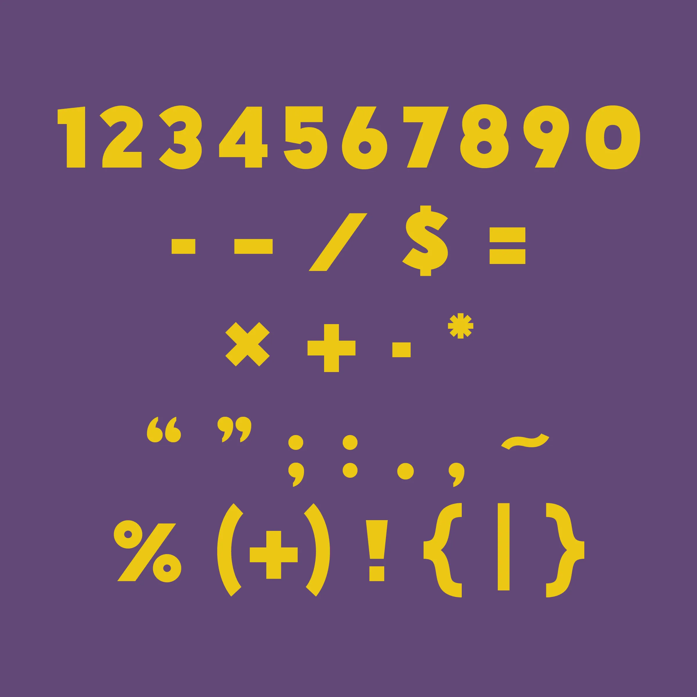
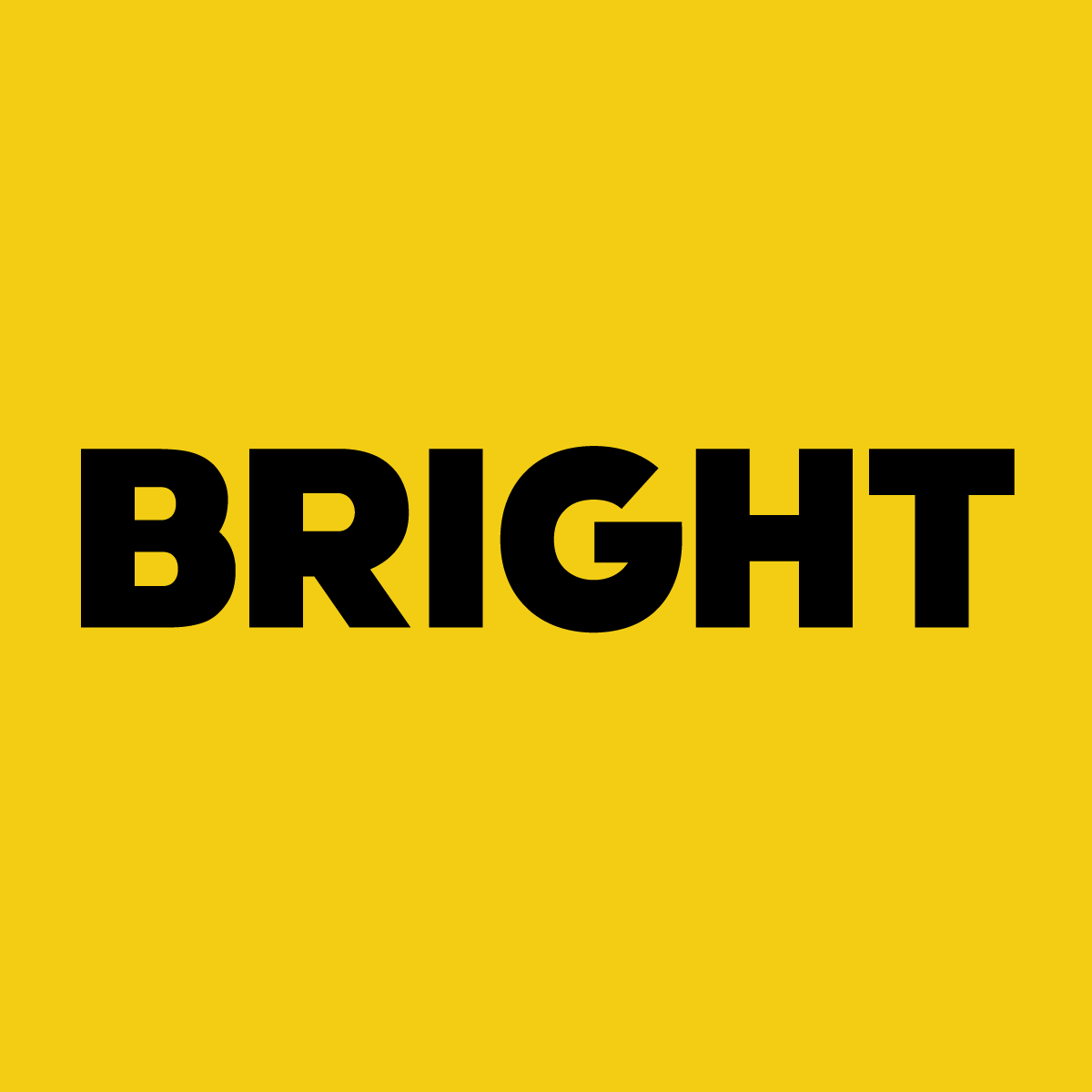
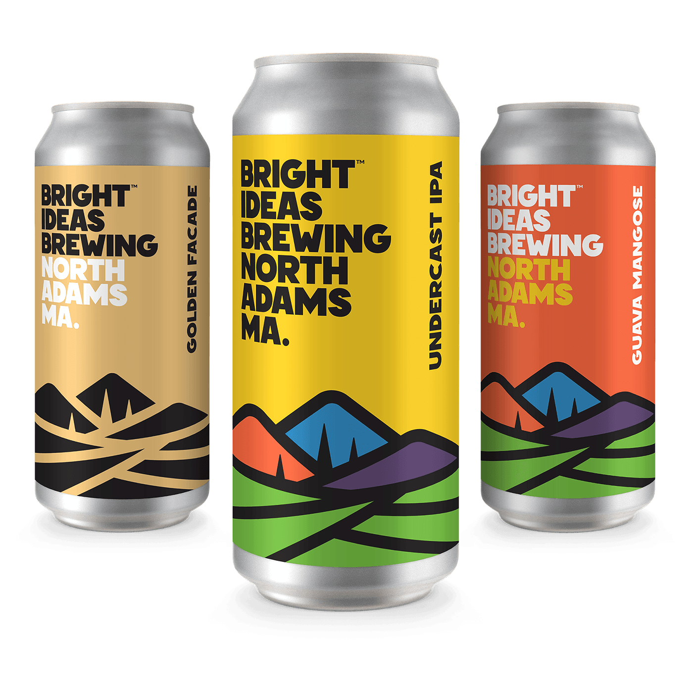
Tactically, the owners required a master set of design assets which could be used in various regalia and compositions (full color, one color, soft goods, coasters, etc). With that in mind, I created a super logo of sorts, the core of which is an environmental pictogram representing what I call ‘curious optimism’. The illustration exists with or without various containers (square, circle, rectangle, crest) and can be dressed in the brand palette of just five core colors. Married with an original typeface I call “Bright,” the result is a modular and confident brand identity which consistently expresses the optimism and attitude of the client.
