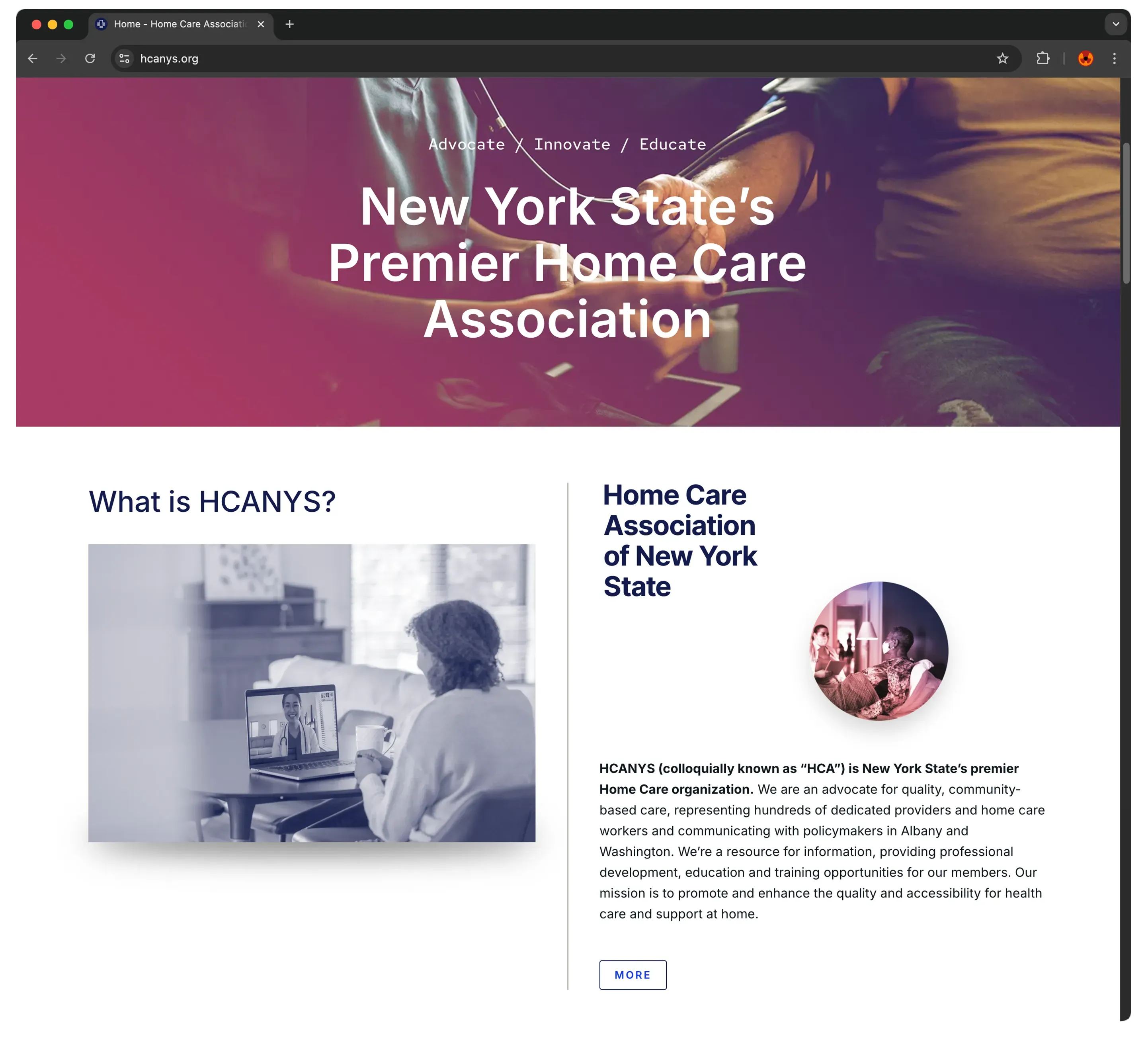
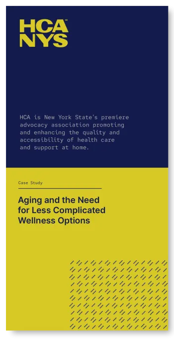
Formed in 1978, The Home Care Association of New York State (HCANYS) is New York's premiere source of knowledge, thought and advocacy for home healthcare-related issues. It is a steadfast and trusted leader in the field. 'HCA's' dedicated and passionate staff continually navigates the complex New York home healthcare ecosystem to provide policy and regulatory expertise, strategic legislative advocacy, research and innovation, education and more.
HCANYS approached me to help bring their visual brand into a new era where the strength and value of their service is better mirrored with funtional and distinct design. Working closely with senior leadership of the HCANYS team, as well as their in-house graphic designer, I created a master set of new visual components, beginning with a new logo and brand style guide. I then applied those assets in a build out of their new website.
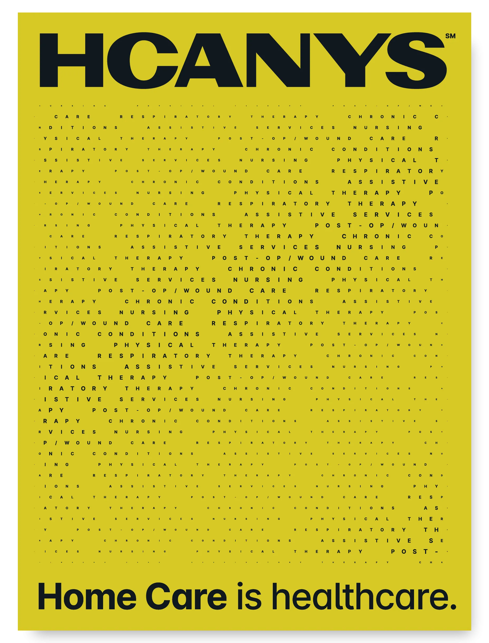
Informed by client feedback from my brand persona investigation, I drew original typography arranged in two functional constructs: a horizontal and a vertical wordmark. Depending on the application, either can serve as the brand “logo”.
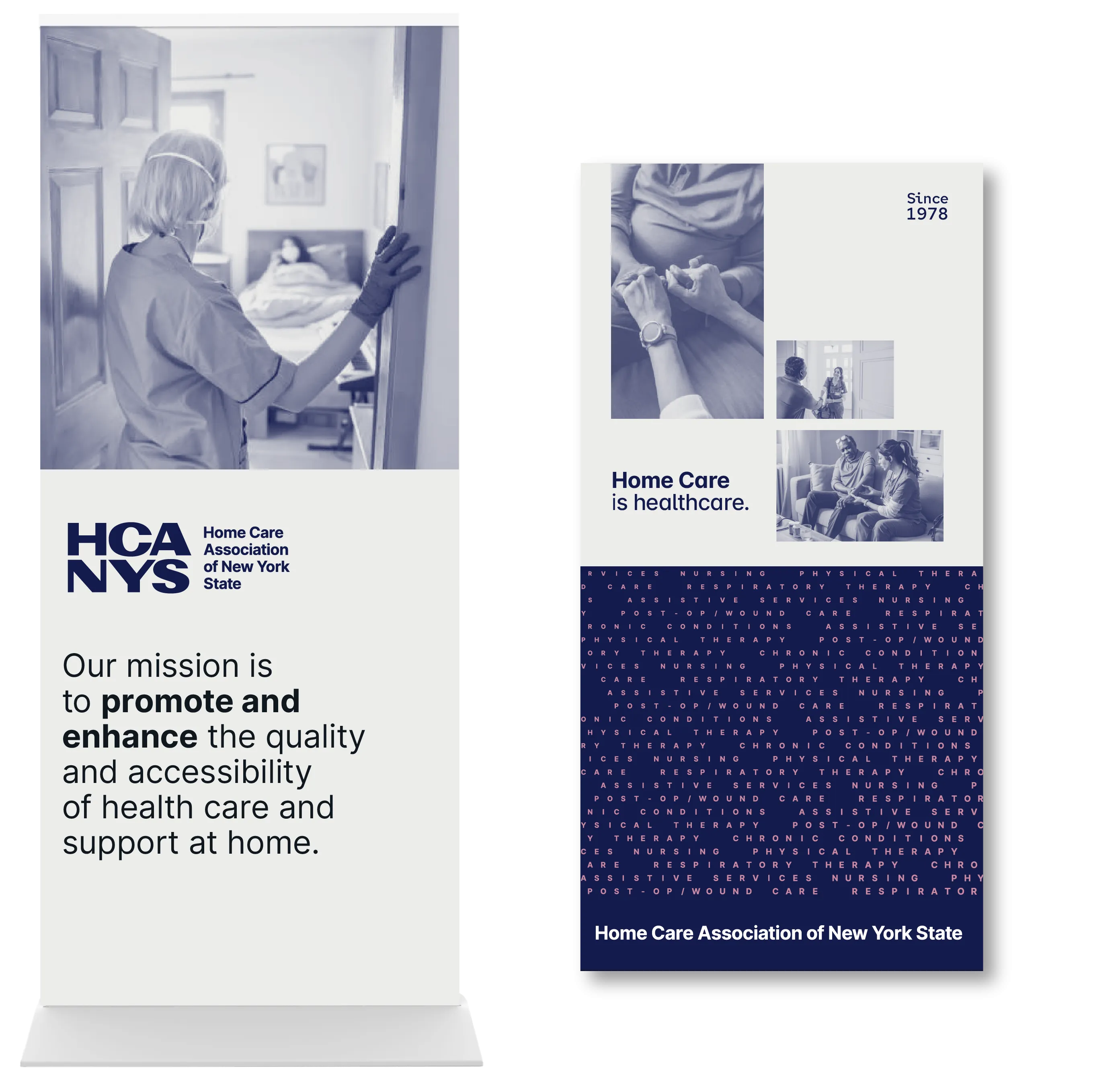
The new logo has an intentionally monolithic style: a well-balanced, firmly-planted sans serif conveying strength of purpose and permanence: truthful characteristics of HCANYS among its members and peers.


Text lists the many professions housed within the “Home Care” industry.

for space activation

Staff Portraits


This logo and accompanying tagline "Home Care is healthcare." is a kind of battle cry for HCANYS. It also functions beautifully as a secondary messaging device.
Tagline written by ![]()
Old Site
Screen grab of old site
The late '00's were tough on corporate websites as responsive design trickled into the mainstream. This one had fallen prey to WordPress extensions which forced a yard sale approach to content architecture.
Old site
Dated, lacks cohesion
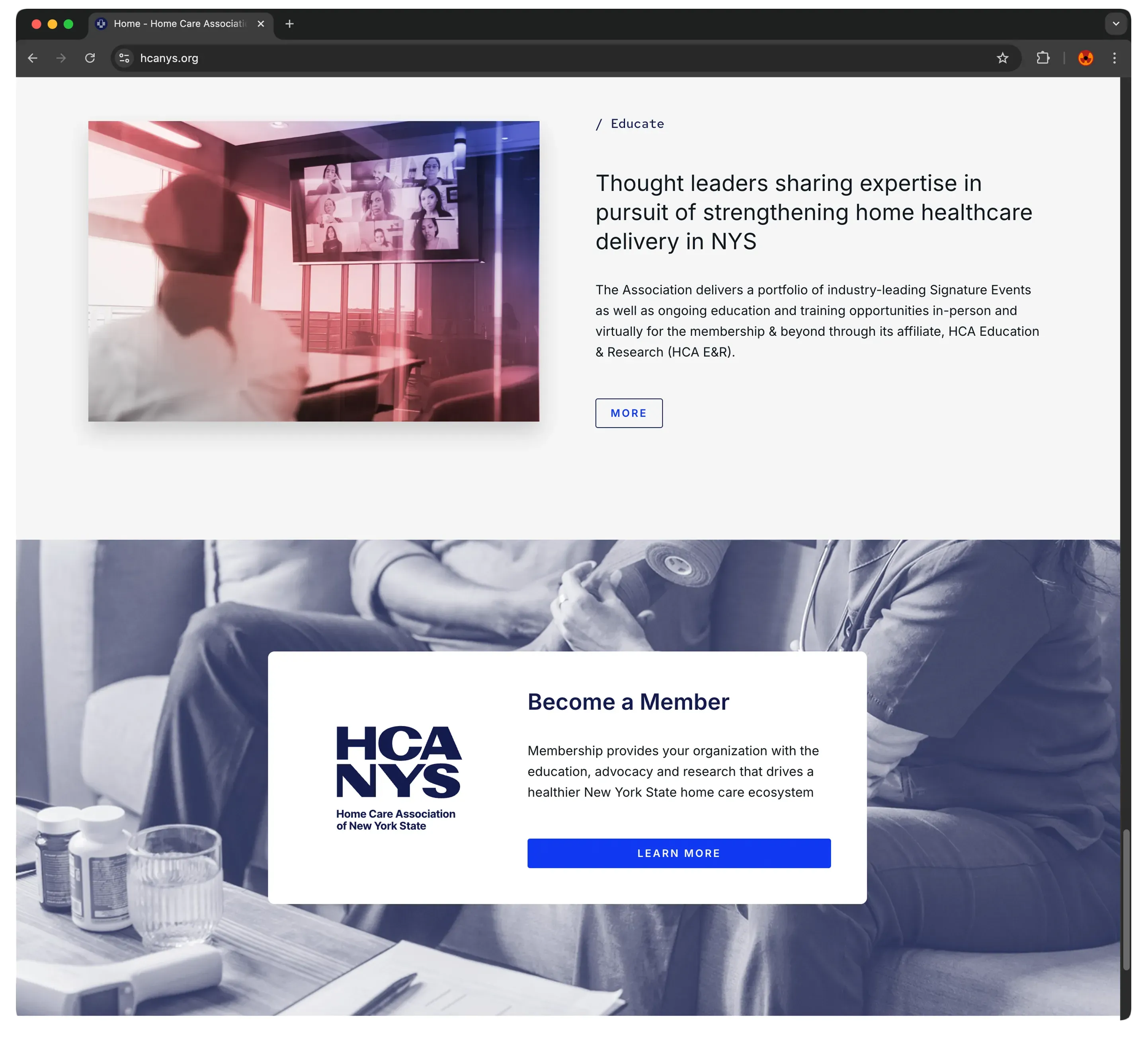
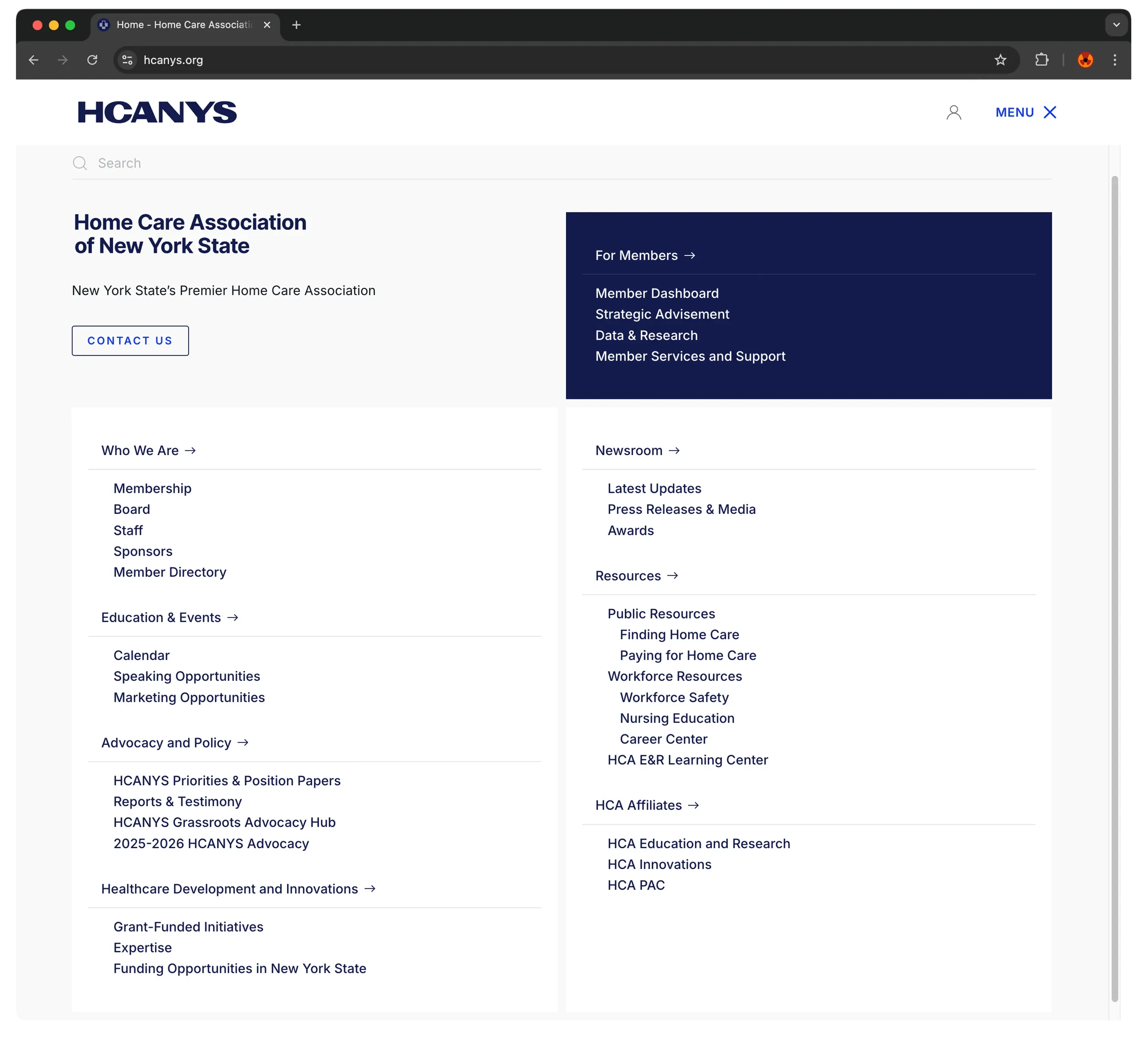
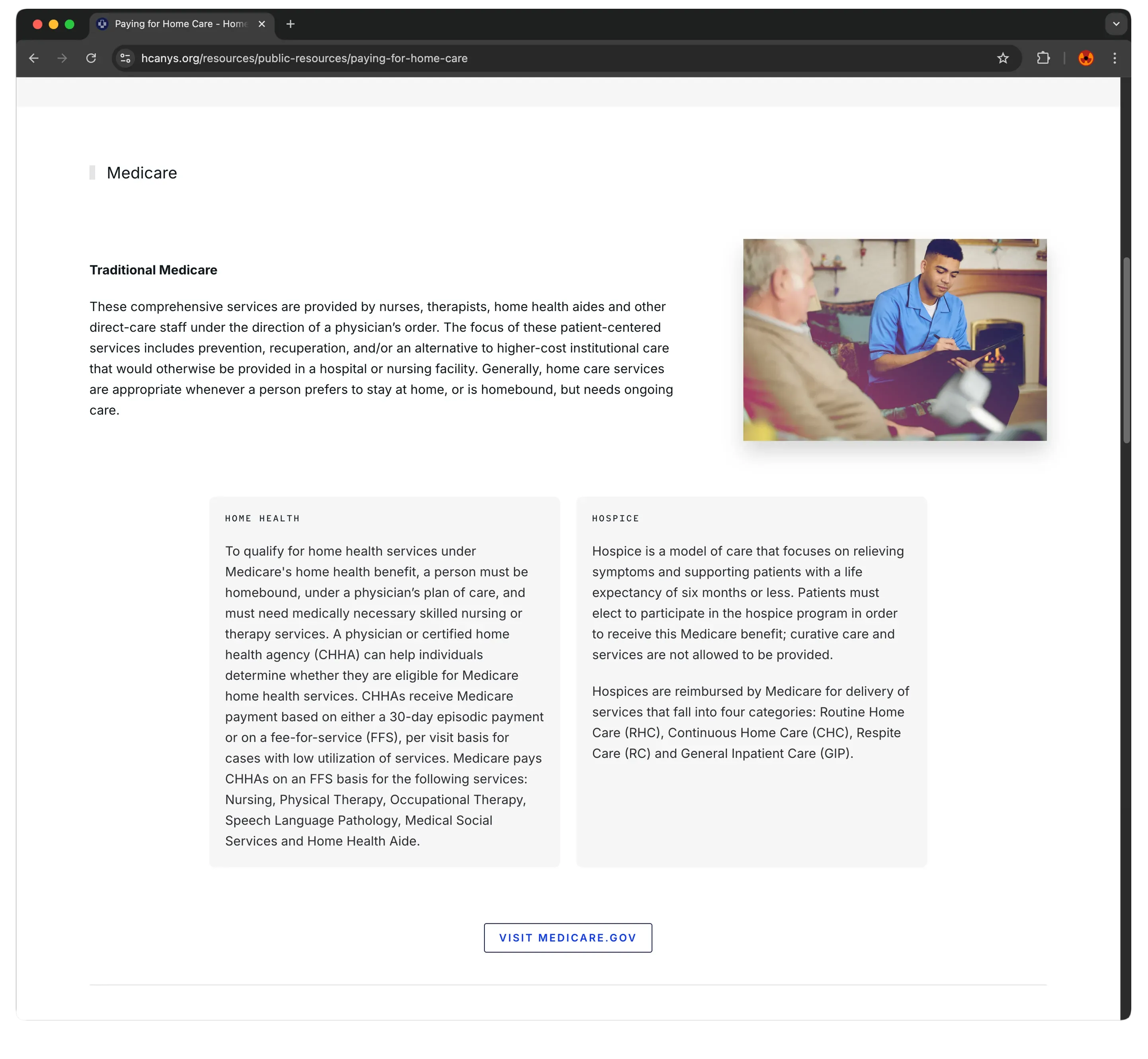
New HCANYS Site